More Related Content
Similar to Show me the_numbers_v2
Similar to Show me the_numbers_v2 (20)
More from Elsa von Licy (20)
Show me the_numbers_v2
- 1. Perceptual Edge 9/12/2005
Copyright © 2004 Stephen Few 1
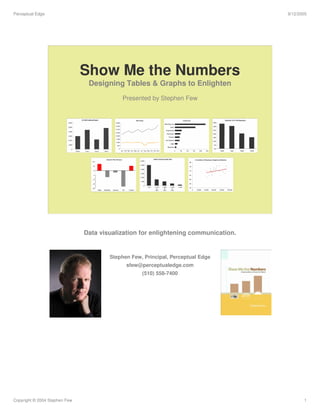
Show Me the Numbers
Designing Tables & Graphs to Enlighten
Presented by Stephen Few
Data visualization for enlightening communication.
Stephen Few, Principal, Perceptual Edge
sfew@perceptualedge.com
(510) 558-7400
- 2. Perceptual Edge 9/12/2005
Copyright © 2004 Stephen Few 2
In 1786, an iconoclastic Scot – William Playfair –
published a small atlas that introduced or greatly
improved most of the quantitative graphs that we
use today.
Prior to this, graphs of quantitative data were little
known.
- 3. Perceptual Edge 9/12/2005
Copyright © 2004 Stephen Few 3
Today, 220 years later, partly due to the arrival of
the PC, graphs are commonplace, fully integrated
into the fabric of modern communications.
Surprisingly, however, Playfair’s innovative efforts
– sprung from meager precedent – are still
superior to most of the graphs produced today.
- 5. Perceptual Edge 9/12/2005
Copyright © 2004 Stephen Few 5
Despite a recent explosion in available data, most
lies stagnant in ever-expanding pools.
Data is useless until we understand what it means
and can clearly communicate that meaning to
those who need it, those whose decisions affect
our world.
- 7. Perceptual Edge 9/12/2005
Copyright © 2004 Stephen Few 7
)LQDOO«
(IIHFWLYH QHWZRUN
PRQLWRULQJ KDV DUULYHG
‡ 1HDU UHDO WLPH
‡ 3KHQRPHQDOO XVHU IULHQGO
‡ ,QVWDQW LQVLJKW Æ HIIHFWLYH
UHVSRQVH
You’ve been invited to another of the many meetings that you’re required to
attend. You’re one of many managers in the Information Technology department.
Like most meetings, this one begins with the light of a projector suddenly
illuminating a screen.
- 8. Perceptual Edge 9/12/2005
Copyright © 2004 Stephen Few 8
Bursting with excitement, the speaker announces that you and everyone else in
the room will now receive a daily report that will inform you how the network is
being utilized, and then this graph appears. You stare at it very intently, trying
your best to keep any hint of confusion from crossing your face. From your
peripheral vision you can see that the CIO (Chief Information Officer) is smiling
broadly and nodding with obvious understanding. You and everyone else in the
room begins to nod enthusiastically as well. You feel very dumb. What you don’t
realize is that you are not alone.
- 9. Perceptual Edge 9/12/2005
Copyright © 2004 Stephen Few 9
I wrote the book, Show Me the Numbers: Designing Tables and Graphs to
Enlighten, published by Analytics Press in 2004, to help business people like
you respond to the challenges that you face every day when presenting
quantitative information.
- 10. Perceptual Edge 9/12/2005
Copyright © 2004 Stephen Few 10
We are awash in data.
“Just show me the numbers!”
We live in the so-called “information age.” So much information is available,
without proper care and skill we can easily drown in it.
The phrase, “Just show me the numbers,” is especially popular among those
responsible for sales organizations who are often frantic to know how sales are
going. They can’t afford to wade through lengthy reports and unnecessary detail;
they just want to see the important numbers right now!
- 11. Perceptual Edge 9/12/2005
Copyright © 2004 Stephen Few 11
Why? Numbers are critical to business.
Everyone is scrambling for metrics, key performance indicators (KPIs),
scorecards, and digital dashboards. Quantitative data is what we rely on most to
measure the health of our businesses, to identify opportunities, and to anticipate
the future.
- 12. Perceptual Edge 9/12/2005
Copyright © 2004 Stephen Few 12
We’re getting better at handling numbers –
Right?
Wrong! We’re getting worse. Despite great progress in our ability to gather and
warehouse data, we’re still missing the boat if we don’t communicate the numbers
effectively. Contrary to popular wisdom, information cannot always speak for
itself.
- 13. Perceptual Edge 9/12/2005
Copyright © 2004 Stephen Few 13
Quantitative information is primarily
communicated through tables and graphs.
But few communicate effectively. Why?
Why? Few people are trained.
Why? Few people recognize the need.
Why? Few examples of good design exist to expose the problem.
“Poor documents are so commonplace that deciphering bad writing and bad
visual design have become part of the coping skills needed to navigate in the so-
called information age.” Karen A. Schriver, Dynamics in Document Design, John
Wiley & Sons, Inc., 1997.
“The public is more familiar with bad design than good design. It is, in effect,
conditioned to prefer bad design, because that is what it lives with. The new
becomes threatening, the old reassuring.” (Kevin Mullet and Darrel Sano,
Designing Visual Interfaces, Sun Microsystems, Inc., 1995 – quoting Paul Rand,
Design, Form, and Chaos)
Effective communication is not always intuitive – it must be learned.
- 14. Perceptual Edge 9/12/2005
Copyright © 2004 Stephen Few 14
Intentional deceit is no longer our biggest
problem
In 1954, Darrell Huff wrote his best-selling book about how people often
intentionally use graphs to spread misinformation, especially in favor of their
own products or causes. Today, vastly more misinformation is disseminated
unintentionally because people don’t know how to use charts to communicate
what they intend.
- 15. Perceptual Edge 9/12/2005
Copyright © 2004 Stephen Few 15
What happened?
The PC happened!
Numbers are commonly obscured, then
made to look SUHWWSUHWW.
When the PC was introduced, software soon made the arduous task of table
and graph creation as easy as 1-2-3 (literally “Lotus 1-2-3”, the software that
was the first to legitimize the PC as a viable tool for business). Unfortunately,
this improvement in ease and efficiency was not accompanied by instruction in
visual design for communication. People today think that if they know how to
click with the mouse to create a table or graph, they know how to present data
effectively.
“In the two centuries since [the invention of the first graphs], …charts have
become commonplace. With the advent of modern computer tools, creating
graphs from data involves trivial effort. In fact, it has probably become too
easy. Graphs are often produced without thought for their main purpose: to
enlighten and inform the reader.” Jonathan G. Koomey, Turning Numbers into
Knowledge, Analytics Press, 2001
I can talk about this all day, but the best way to make my point convincingly is
to show you.
- 17. Perceptual Edge 9/12/2005
Copyright © 2004 Stephen Few 17
Example #1 - Good
This table presents the same information that appears in the graph and more,
but it does so clearly and simply. One common problem in the display of
quantitative information is that people often choose the wrong medium of
display – a graph when a table would work better and vice versa. Too seldom
do report developers consider their message and carefully design its
presentation to communicate that message effectively.
- 18. Perceptual Edge 9/12/2005
Copyright © 2004 Stephen Few 18
Example #2 - Poor
I found this table on the Web site for Bill Moyers’ public television show “Now”.
I felt that it provided important information that deserved a better form of
presentation. In this case the story could be told much better in visual form.
- 19. Perceptual Edge 9/12/2005
Copyright © 2004 Stephen Few 19
Example #2 - Good
This series of related graphs tells the story in vivid terms and brings facts to
light that might not ever be noticed in the table.
- 20. Perceptual Edge 9/12/2005
Copyright © 2004 Stephen Few 20
Example #3 - Poor
The purpose of this graph is to display how Company G is doing in relation to its
competitors. Is its message clear?
Often, when someone creates a graph that appears inadequate somehow, they
try to fix it with sizzle, as in the next slide.
- 21. Perceptual Edge 9/12/2005
Copyright © 2004 Stephen Few 21
Example #3 - Worse
Does the addition of 3D improve this pie chart? Definitely not. In fact, it actually
makes it harder to read.
- 23. Perceptual Edge 9/12/2005
Copyright © 2004 Stephen Few 23
Example #3 - Poor
Without the title, could you determine the purpose of this graph? The design of
a graph should clearly suggest its purpose.
In the general field of design, we speak of things having “affordances.” These
are characteristics of something’s design that declare its use; a teapot has a
handle and a door has a push-plate. Graphs should also be designed in a
manner that clearly suggests their use.
Besides the lack of affordances, what else about this graph undermines it
ability to communicate?
- 24. Perceptual Edge 9/12/2005
Copyright © 2004 Stephen Few 24
Example #3 - Good
The design of this quantitative message ties clearly to its purpose. It is obvious to
the reader that its intention is to compare the performance of SlicersDicers to that
of the other eight products.
This solution uses a technique called “small multiples” – a series of related
graphs that differ only along a single variable, in this case the various products.
This technique has been known for over 20 years, but I bet you’ve never used
software that makes this easy to do.
- 25. Perceptual Edge 9/12/2005
Copyright © 2004 Stephen Few 25
Warning!
Even software vendors
encourage poor design
They encourage poor design by:
• providing useless features and gizmos
• providing formatting defaults that undermine a clear display of the data
• producing documentation that demonstrates poor design
• marketing flash and dazzle, rather than good design
“There are two ways of constructing a software design [or a table or graph
design]: one way is to make it so simple that there are obviously no deficiencies;
the other is to make it so complicated that there are no obvious deficiencies.” C.
A. R. Hoare
Let’s take a quick tour of several graph examples from the user documentation
and Web sites of several software vendors to illustrate my point.
- 26. Perceptual Edge 9/12/2005
Copyright © 2004 Stephen Few 26
Example: Totals of something or other by year
This graph gets extra points for the creative use of color – a bit too creative,
don’t you think? What do the different colors mean?
(Source: Web site of Corda Technologies, Incorporated.)
- 27. Perceptual Edge 9/12/2005
Copyright © 2004 Stephen Few 27
Example: Total medals by country and type
I guess the round object in the background is a medal. Even if it looked more
like a medal, it would still do nothing but distract from the data itself. Can you
make sense of the quantitative scale along the vertical axis?
(Source: Web site of SAS Institute Inc.)
- 28. Perceptual Edge 9/12/2005
Copyright © 2004 Stephen Few 28
Example: New sales opportunities by lead quality
Notice the effort that is involved in shifting your focus back and forth between the
pie chart and the legend to determine what each slice represents, especially
given the fact that the order of the items in the legend does not match the order in
the pie. Also notice how slices that are different in value often appear to be the
same size.
(Source: Web site of Siebel Systems.)
- 29. Perceptual Edge 9/12/2005
Copyright © 2004 Stephen Few 29
Example: Revenue by service line
Even turning a pie into a donut doesn’t make it any more palatable. A donut chart
is just a pie with a hole in it.
(Source: User documentation of Business Objects.)
- 30. Perceptual Edge 9/12/2005
Copyright © 2004 Stephen Few 30
Example: Percentage sales by country
Breaking a single pie into five pies and tilting them to the left doesn’t seem to
help either.
(Source: Web site of Visual Mining, Inc.)
- 31. Perceptual Edge 9/12/2005
Copyright © 2004 Stephen Few 31
Example: Purchases by product line and buyer
When you design a graph that is almost unreadable, you can always add 3D and
hope your audience is too impressed to care. (You know I’m kidding – right?)
(Source: Web site of Brio Software, prior to its acquisition by Hyperion Solutions
Corporation.)
- 32. Perceptual Edge 9/12/2005
Copyright © 2004 Stephen Few 32
Example: Revenue by resort and year
2-D lines are so much more interesting than the regular ones. Don’t you agree?
(By now, I’m sure my sarcasm is evident.)
(Source: User documentation of Business Objects.)
- 33. Perceptual Edge 9/12/2005
Copyright © 2004 Stephen Few 33
Example: Revenue by resort and month
But 3-D lines are the height of fashion. And time trends with the months sorted in
alphabetical rather than chronological order are so much more creative.
(Source: User documentation of Business Objects.)
- 34. Perceptual Edge 9/12/2005
Copyright © 2004 Stephen Few 34
Example: Revenue by sales channel and quarter
No matter how bright the bars, you can’t see them if they’re hidden behind others.
Can you determine fax revenue for Q3 or direct sales revenue for Q4? This
problem, when data is hidden behind other data, is called occlusion.
(Source: Web site of Cognos Incorporated.)
- 35. Perceptual Edge 9/12/2005
Copyright © 2004 Stephen Few 35
Example: Revenue by product and quarter
Most of the bars in this graph are so short, they’re barely visible, and impossible
to interpret. Notice that this graph contains four quarters worth of data, but the
sole label of “Q1” suggests otherwise. And what do you think of the dark grid
lines? They make this graph look a little like a prison cell from which the numbers
will never escape!
(Source: User documentation of Business Objects.)
- 36. Perceptual Edge 9/12/2005
Copyright © 2004 Stephen Few 36
Example: Expenses by GL account category and account
I call this a “Scottish Graph,” because it looks a lot like the tartan print of a kilt.
This is just plain absurd. Does this vendor really believe that people can interpret
numbers as a continuum of color ranging from red through black to blue? The
quantitative key at the bottom is a hoot. It includes six decimal places of precision
for what must be dollars, but you’d be lucky to interpret any of the numbers in the
graph within $10,000 of the actual value.
(Source: Web site of Visualize, Inc.)
- 37. Perceptual Edge 9/12/2005
Copyright © 2004 Stephen Few 37
Example: Hotel revenue by service and quarter
Good thing the quarters are labeled so largely in the legend, otherwise I’d never
be able to make sense of this radar graph.
(Source: User documentation of Business Objects.)
- 38. Perceptual Edge 9/12/2005
Copyright © 2004 Stephen Few 38
Example: Revenue by region and year
How can I obscure thee? Let me count the ways: 1) Overlapping areas, 2) years
running counter-clockwise, and 3) a different scale on the 1994 axis. If I use a
simple bar chart instead, my manager might think that I’m lazy and
unsophisticated. This will show her how valuable I am.
(Source: Web site of Visualize, Inc.)
- 39. Perceptual Edge 9/12/2005
Copyright © 2004 Stephen Few 39
Example: Guest count and revenue by resort
Why use a scatter plot to display the correlation between guest count and
revenue when you can use a polar graph with counter-clockwise measures of
revenue? See if you can make sense of this graph.
(Source: User documentation of Business Objects.)
Note: You might have noticed that several of these examples of poor graph
design have come from Business Objects’ user documentation. This is not
because Business Objects contributes more to poor graph design than other
software vendors, but simply because I have convenient to their user
documentation and not to that of the other vendors.
- 40. Perceptual Edge 9/12/2005
Copyright © 2004 Stephen Few 40
Example: Revenue vs. costs per month
Circles within and behind circles. Pretty! Pretty silly that is.
(Source: Web site of Visual Mining, Inc.)
- 42. Perceptual Edge 9/12/2005
Copyright © 2004 Stephen Few 42
Do the vendors poor examples matter?
Contest Scenario:
This scenario involves the display of
departmental salary expenses. It is used by
the VP of Human Resources to compare the
salary expenses of the company’s eight
departments as they fluctuate through time,
in total and divided between exempt and
non-exempt employees.
You might argue that the poor example set by the vendors doesn’t really influence
people in the real world. Unfortunately, that’s not the case. Take a look at a few
examples of data presentations that were submitted by graphing specialists to a
competition sponsored by DM Review magazine.
- 43. Perceptual Edge 9/12/2005
Copyright © 2004 Stephen Few 43
Time-Series Solution #1
Every charting software vendor out there, with almost no exceptions, feature 3-D
graphs. They look so impressive, but do they work? Users fall prey to the notion
that 2-D displays are old-school, and that they must advance to displays like the
one shown above to be taken seriously. The problem with 3-D displays of
abstract business data, however, is that they are almost impossible to read.
- 44. Perceptual Edge 9/12/2005
Copyright © 2004 Stephen Few 44
Time-Series Solution #2
Vendors introduce display methods that are absurd, that show a complete
ignorance of visual perception. Trends cannot be discerned by examining a series
of pie charts and quantitative values cannot be effectively encoded as differing
hues.
- 45. Perceptual Edge 9/12/2005
Copyright © 2004 Stephen Few 45
Time-Series Solution #3
Based on the example set by the vendors, users attempt to dazzle their audience
with bright colors and pretty pictures, often resulting in displays like this that
completely obscure a relatively simple message. I challenge you to make sense
of this graph.
- 46. Perceptual Edge 9/12/2005
Copyright © 2004 Stephen Few 46
Time-Series Solution #4
This example features software that uses a visual object called a glyph, which is
meant to simultaneously encode multiple variables about an entity. In this case a
set of nine small rectangles represents a company’s expenses for a given month,
and each of the individual small rectangles encodes the expenses in dollars of a
single department for a given month. Glyphs are meant to do something quite
different from this example. They are not meant and are not able to effectively
encode departmental expenses as they vary through time. Why has this user
applied this software so absurdly? Because the vendor itself promotes such use.
- 47. Perceptual Edge 9/12/2005
Copyright © 2004 Stephen Few 47
Time-Series Solution – One that works
Finally, we see a visual display that works. Departmental expenses are encoded
as simple line graphs, which beautifully present the overall trend and individual
ups and downs of the values through time. This arrangement of eight graphs
within eye span, one per department, sorted from the greatest to least expenses,
tells the data’s story clearly. Here’s a rare case where a vendor’s expert design
and thoughtful examples encouraged users to communicate effectively.
- 48. Perceptual Edge 9/12/2005
Copyright © 2004 Stephen Few 48
“Above all else show the data.”
Edward Tufte
What is the goal of tables of graphs?
Communication
This Edward R. Tufte quote is from his milestone work, The Visual Display of
Quantitative Information, published by Graphics Press in 1983.
In tables and graphs:
• The message is in the data.
• The medium of communication, especially for graphs, is visual.
• To communicate the data effectively, you must understand visual
perception – what works, what doesn’t, and why.
- 49. Perceptual Edge 9/12/2005
Copyright © 2004 Stephen Few 49
Communication problems – whether
verbal or visual – are basically the same
I returned, and saw under the sun, that the race is not to
the swift, nor the battle to the strong, neither yet bread to
the wise, nor yet riches to men of understanding, nor yet
favor to men of skill; but time and chance happen to them
all.
Ecclesiastes 9:11 (King James version of the Bible)
Objective consideration of contemporary phenomena
compels the conclusion that success or failure in
competitive activities exhibits no tendency to be
commensurate with innate capacity, but that a considerable
element of the unpredictable must invariably be taken into
account.
George Orwell’s rewrite of this passage into bloated prose
The problems that are common in verbal language, which obscure
communication, are the same as those we must learn to avoid in data
presentation. We have a tendency to complicate what we have to say,
rendering our message difficult to understand. In his book entitled On Writing
Well, William Zinsser suggests four best practices for good writing:
1. Clarity
2. Simplicity
3. Brevity
4. Humanity
These closely parallel the practices that I teach for good data presentation.
- 50. Perceptual Edge 9/12/2005
Copyright © 2004 Stephen Few 50
Three important business competencies
Literacy
Numeracy
Graphicacy
All three seem to be declining in
America.
My friend Howard Spielman argues that there are three basic competencies
that are needed in business:
• Literacy: the ability to think and communicate in words, both spoken and
written
• Numeracy: the ability to think and communicate in numbers
• Graphicacy: the ability to think and communicate in images
I believe that businesses in America are failing in all three areas today,
especially in graphicacy, which involves a set of skills that very few people
have ever learned, but rely on every day.
- 51. Perceptual Edge 9/12/2005
Copyright © 2004 Stephen Few 51
The two fundamental challenges of data
presentation
1. Determining the medium that
tells the story best
2. Designing the visual components to
tell the story clearly
0
10
20
30
40
50
60
70
80
90
1st Qtr 2nd Qtr 3rd Qtr 4th Qtr
East
West
North
From
to
Revenue
0
20
40
60
80
100
1st Qtr 2nd Qtr 3rd Qtr 4th Qtr
Year 2003
U.S.$
East West North
1,592,36777,211Total
845,98442,374Beverage
746,38334,837Food
RevenueUnits SoldProduct
or
0 20 40 60 80
Marketing
Operations
Finance
Sales
and
which kind?
Either
1. You begin by determining the best medium for your data and the
message you wish to emphasize. Does it require a table or a graph?
Which kind of table or graph?
2. Once you’ve decided, you must then design the individual components
of that display to present the data and your message as clearly and
efficiently as possible.
The solutions to both of these challenges are rooted in an understanding of
visual perception.
- 52. Perceptual Edge 9/12/2005
Copyright © 2004 Stephen Few 52
Match the display to your message
In the top example, the message contained in the titles is not clearly displayed
in the graphs. The message deals with the ratio of indirect to total sales – how
it is declining domestically, while holding steady internationally. You’d have to
work hard to get this message the display as it is currently designed.
The bottom example, however, is designed very specifically to display the
intended message. Because this graph is skillfully designed to communicate,
its message is crystal clear. A key feature that makes this so is the choice of
percentage for the quantitative scale, rather than dollars.
- 53. Perceptual Edge 9/12/2005
Copyright © 2004 Stephen Few 53
Eeney, meeney, miney, moe – what type
of display should I use this time?
or
If you were the person responsible for creating a means to display the relative
merits of candidates for employment, you would have to choose the best visual
means to communicate this information. You shouldn’t just choose any old
method, and especially not a particular one because it looks the snazziest. A
graph isn’t always the best way to get your message across. In this case a
simple table would do the job better.
(Source: the radar graph on the left was found on the Web site of Visual
Mining, Inc.)
- 54. Perceptual Edge 9/12/2005
Copyright © 2004 Stephen Few 54
What characteristics define tables?
• Data arranged in columns and rows
• Data encoded as text
Notice that I didn’t say that grid lines are essential to tables. Spreadsheet
software and its ever-present grid lines to outline each cell incorrectly suggests
that grid lines are necessary, but they are not.
- 55. Perceptual Edge 9/12/2005
Copyright © 2004 Stephen Few 55
What characteristics define graphs?
• Values are displayed in an area defined by one or
more axes
• Values are encoded as visual objects positioned in
relation to the axes
• Axes provide scales (quantitative and categorical) that
assign values and labels to the data objects
Quantitative graphs were originally an extension of maps, with their scales of
longitude and latitude.
- 56. Perceptual Edge 9/12/2005
Copyright © 2004 Stephen Few 56
• Used to look up individual values
Tables work best when
• Used to compare individual values
• Data must be precise
• You must include multiple units of measure
- 57. Perceptual Edge 9/12/2005
Copyright © 2004 Stephen Few 57
What do graphs do best?
Graphs show relationships between values by
giving them shape.
The old saying, “A picture is worth a thousand words,” applies quite literally to
quantitative graphs. By displaying quantitative information in visual form,
graphs efficiently reveal information that would otherwise require a thousand
words or more to adequately describe.
“[When] we visualize the data effectively and suddenly, there is what Joseph
Berkson called ‘interocular traumatic impact’: a conclusion that hits us between
the eyes.” William S. Cleveland, Visualizing Data, Hobart Press, 1993.
Take a moment to identify the various types of information that are revealed by
the shape of the data in this graph.
- 58. Perceptual Edge 9/12/2005
Copyright © 2004 Stephen Few 58
Graphs bring relationships to light
What’s the
message?
The fact that job satisfaction for employees without a college degree decreases
significantly in their later years doesn’t jump out at you when you examine the
table, but it is immediately obvious when you examine the graph.
- 59. Perceptual Edge 9/12/2005
Copyright © 2004 Stephen Few 59
But only if you design them correctly
The type of graph that is selected and the way it’s designed also have great
impact on the message that is communicated. By simply switching from a line
graph to a bar graph, the decrease in job satisfaction among those without
college degrees in their later years is no longer as obvious.
- 60. Perceptual Edge 9/12/2005
Copyright © 2004 Stephen Few 60
1. Quantitative values
(a.k.a. measures)
Quantitative information always consists
of two types of data
2. Categorical labels
(a.k.a. dimensions)
Quantitative values are numbers – measures of something related to the
business (number of orders, amount of profit, rating of customer satisfaction,
etc.). Categorical subdivisions break the measures down into meaningful
groups and give them meaningful labels.
- 61. Perceptual Edge 9/12/2005
Copyright © 2004 Stephen Few 61
A scale on a graph is either quantitative or
categorical
Quantitative
How much?
Categorical
What?
A quantitative scales consists of a range of values that is used to measure
something. A categorical scale identifies what is being measured, listing the
separate instances of a variable, the items in a category.
- 62. Perceptual Edge 9/12/2005
Copyright © 2004 Stephen Few 62
Different types of categorical scale
Nominal
Sales Operations Engineering HR Marketing Accounting
Ordinal
1st 2nd 3rd 4th 5th 6th
Interval
0-99 100-199 200-299 300-399 400-499 500-599
?
January February March April May June
Categorical scales come in several types, three of which are common in
graphs:
• Nominal: The individual items along the scale differ in name only. They
have no particular order and represent no quantitative values.
• Ordinal: The individual items along the scale have an intrinsic order of
rank, but also do not represent quantitative values.
• Interval: The individual items along the scale have an intrinsic order,
which in this case does correspond to quantitative values. Interval scales
begin as a range of quantitative values, but are converted into a
categorical scale by subdividing the range into small ranges of equal size,
each of which is given a label (e.g., “0-99” or “>= 0 and <100”).
The last scale above, consisting of January through June, is an interval scale.
It is ordinal, in that the months have an intrinsic order, but it is an interval scale
because months are equal subdivisions of time, and time is quantitative in that
units of time can be added, subtracted, and so on.
- 63. Perceptual Edge 9/12/2005
Copyright © 2004 Stephen Few 63
Quantitative messages always involve
relationships.
Each of these graphs illustrates a different type of quantitative relationship. Just
as in life in general, the interesting and important content of a graph always
involves relationships.
- 64. Perceptual Edge 9/12/2005
Copyright © 2004 Stephen Few 64
Relationship? Time-Series
Time
A time-series graph has a categorical scale that represents time, subdivided
into a particular unit of time, such as years, quarters, months, days, or even
hours. These graphs provide a powerful means to see patterns in the values as
they march through time.
- 65. Perceptual Edge 9/12/2005
Copyright © 2004 Stephen Few 65
RankingRelationship?
1
2
3
4
5
6
7
8
Ranking graphs show the sequence of a series of categorical subdivisions,
based on the measures associated with them.
- 66. Perceptual Edge 9/12/2005
Copyright © 2004 Stephen Few 66
Part-to-WholeRelationship?
+ + + =100%
A part-to-whole graph shows how the measures associated with the individual
categorical subdivisions of a full set relate to the whole and to one another.
- 67. Perceptual Edge 9/12/2005
Copyright © 2004 Stephen Few 67
DeviationRelationship?
A deviation graph shows how the measures associated with one or more sets
of categorical subdivision differ from a set of reference measures.
- 68. Perceptual Edge 9/12/2005
Copyright © 2004 Stephen Few 68
DistributionRelationship?
This type of distribution graph, called a frequency distribution, shows the
number of times something occurs across consecutive intervals of a larger
quantitative range. In a frequency distribution, a quantitative scale (in this case
the range of dollar values of orders) is converted to a categorical scale by
subdividing the range and giving each of the subdivisions a categorical label
(“< $10”, and so on).
- 69. Perceptual Edge 9/12/2005
Copyright © 2004 Stephen Few 69
CorrelationRelationship?
A correlation graph shows whether two paired sets of measures vary in relation
to one another, and if so, in which direction (positive or negative) and to what
degree (strong or weak). If the trend line moves upwards, the correlation is
positive; if it moves downwards, it is negative. A positive correlation indicates
that as the values in one data set increase, so do the values in the other data
set. A negative correlation indicates that as the values in one data set increase,
the values in the other data set decrease. In a scatter plot like this, the more
tightly the data points are grouped around the trend line, the stronger the
correlation.
- 70. Perceptual Edge 9/12/2005
Copyright © 2004 Stephen Few 70
Nominal ComparisonRelationship?
The term nominal means “in name only.” When items relate to one another
nominally, they have no particular order. Whenever you find yourself creating a
graph with only a nominal relationship, ask yourself if you could improve it by
showing another relationship as well, such as a ranking or a part-to-whole.
- 71. Perceptual Edge 9/12/2005
Copyright © 2004 Stephen Few 71
• Nominal comparison
• Time-series
• Ranking
• Part-to-whole
• Deviation
• Distribution
• Correlation
The seven common relationships in graphs
Without reviewing the last few slides, unless you must as a reminder, try to
describe a real-world example of each type of relationship.
- 72. Perceptual Edge 9/12/2005
Copyright © 2004 Stephen Few 72
What’s the other half?
Selecting the right medium is half the battle.
Designing each component to speak clearly.
Once you’ve selected the best means to display your data and message, the
next big challenge is to design the visual components of the display to state
your message clearly, without distraction, and to highlight what’s most
important.
- 73. Perceptual Edge 9/12/2005
Copyright © 2004 Stephen Few 73
The Data-Ink Ratio
Data Ink Non-Data Ink
But besides the data, what else is there? According to Edward Tufte, tables
and graphs consist of two types of ink: data ink and non-data ink. He
introduced the concept of the “data-ink ratio” in his 1983 classic The Visual
Display of Quantitative Data. He argued that the ratio of ink used to display
data to the total ink should be high. In other words, ink that is used to display
anything that isn’t data should be reduced to a minimum.
- 74. Perceptual Edge 9/12/2005
Copyright © 2004 Stephen Few 74
Steps in the design process
1. Reduce the non-data ink. 2. Enhance the data ink.
Remove unnecessary data ink.
Emphasize the most important
data ink.
Remove unnecessary non-data ink.
De-emphasize and regularize the
remaining non-data ink.
“In anything at all, perfection is finally attained not when there is no longer
anything to add, but when there is no longer anything to take away.” Antoine
de St. Exupery
- 75. Perceptual Edge 9/12/2005
Copyright © 2004 Stephen Few 75
Effective data presentation is rooted in an
understanding of visual perception
To know how to present information visually in an effective way, you must
understand a little about visual perception – what works, what doesn’t, and why.
“Why should we be interested in visualization? Because the human visual system is
a pattern seeker of enormous power and subtlety. The eye and the visual cortex of
the brain form a massively parallel processor that provides the highest-bandwidth
channel into human cognitive centers… However, the visual system has its own
rules. We can easily see patterns presented in certain ways, but if they are
presented in other ways, they become invisible…If we can understand how
perception works, our knowledge can be translated into rules for displaying
information… If we disobey the rules, our data will be incomprehensible or
misleading.” Colin Ware, Information Visualization: Perception for Design, 2nd
Edition, Morgan Kaufmann Publishers, San Francisco, 2004.
- 76. Perceptual Edge 9/12/2005
Copyright © 2004 Stephen Few 76
Visual perception is not just camera work
Square A is darker than B, right?
Actually, squares A and B are exactly the same color.
- 77. Perceptual Edge 9/12/2005
Copyright © 2004 Stephen Few 77
We perceive differences, not absolutes
Take a closer look
What we see is not a simple recording of what is actually out there. Seeing is an
active process that involves interpretations by our brains of data that is sensed by
our eyes in an effort to make sense of it in context. The presence of the cylinder
and its shadow in the image of the checkerboard triggers an adjustment in our
minds to perceive the square labeled B as lighter than it actually is. The illusion is
also created by the fact that the sensors in our eyes do not register actual color
but rather the difference in color between something and what’s nearby. The
contrast between square A and the light squares that surround it and square B
and the dark squares that surround it cause us to perceive squares A and B quite
differently, even though they are actually the same color.
The ability to use graphs effectively requires a basic understanding of how we
unconsciously interpret what we see.
- 78. Perceptual Edge 9/12/2005
Copyright © 2004 Stephen Few 78
Context affects visual perception
This image illustrates the surprising affect that a simple change in the lightness of
the background alone has on our perception of color. The large rectangle displays
a simple color gradient of a gray-scale from fully light to fully dark.The small
rectangle is the same exact color everywhere it appears, but it doesn’t look that
way because our brains perceive visual differences rather than absolute values,
in this case between the color of the small rectangle and the color that
immediately surrounds it.
Among other things, understanding this should tell us that using a color gradient
as the background of a graph should be avoided.
- 79. Perceptual Edge 9/12/2005
Copyright © 2004 Stephen Few 79
We even perceive the written word
differently than you probably think
Aoccdrnig to rscheearch at Cmabridge
Uinervtisy, it deosn’t mttaer In what oredr
the ltteers in a word are, the olny iprmoatnt
tihng is that the frist and lsat ltteer be at the
rghit pclae. The rset can be a Total mses and
you can still raed it wouthit problem. This is
bcuseae the huamn mnid deos not raed ervey
lteter by istlef, but the word as a wlohe.
amzanig huh?
Even our perception of written language works much differently than we assume.
To communicate effectively, we must present information in a way that matches
how people perceive and think.
- 80. Perceptual Edge 9/12/2005
Copyright © 2004 Stephen Few 80
How two-dimensional xy graphs work
x
A B C D E
y
1
2
3
4
5
6
Most 2-D graphs work by means of a system of coordinates, encoding each value
as a coordinate along two perpendicular axes, X (horizontal) and Y (vertical).
Rene Descartes, the 17th century mathematician and philosopher (“I think,
therefore I am.”) invented this XY coordinate system for use in mathematics, not
for communicating quantitative data.
- 82. Perceptual Edge 9/12/2005
Copyright © 2004 Stephen Few 82
Data encoding objects
x
A B C D E
y
1
2
3
4
5
6
Lines
Line encode individual values as 2-D position (at each data point connected by
the line), but by connecting the data values the added characteristics of slope and
direction also carry information.
- 83. Perceptual Edge 9/12/2005
Copyright © 2004 Stephen Few 83
Data encoding objects
x
A B C D E
y
1
2
3
4
5
6
Bars
Bars encode individual values as 2-D position at the endpoint of the bar, and also
as line length.
- 84. Perceptual Edge 9/12/2005
Copyright © 2004 Stephen Few 84
Useful variations of data encoding objects
Six variations of these three data encoding objects work well in XY graphs. Each
has its own strengths and weaknesses.
- 85. Perceptual Edge 9/12/2005
Copyright © 2004 Stephen Few 85
The strengths of bars
The strength of bars, because they have such great visual weight, like great
column rising into the sky, is their ability to emphasize individual discrete values.
Because bars encode quantitative values in part as line length, they must always
begin at a value of zero, otherwise their length does not correspond accurately to
their quantitative value.
- 87. Perceptual Edge 9/12/2005
Copyright © 2004 Stephen Few 87
Bar values should always start at zero
Because bars encode quantitative values in part as line length, they must always
begin at a value of zero, otherwise their length does not correspond accurately to
their quantitative value.
MicroStrategy’s customer service score is only 33% greater than the lowest
scoring product, Cognos PowerPlay, but the difference is bar lengths in
MicroStrategy’s graph is 750% greater. That’s a lie factor of 2,301%
(33%/750%=2,301%). Notice how different the data looks when encoded
accurately in the bottom graph.
- 88. Perceptual Edge 9/12/2005
Copyright © 2004 Stephen Few 88
The strengths of lines
The strength of lines is their ability to emphasize the overall trend of the values
and the nature of change from one value to the next. They should only be used
to encode continuous variables along an interval scale, never discrete
variables. The most common examples of continuous variables are those
corresponding to a time series (continuous units of time) or a frequency
distribution (contiguous ranges of quantity, such as 0-5, 6-10, 11-15, and so
on).
- 89. Perceptual Edge 9/12/2005
Copyright © 2004 Stephen Few 89
What’s wrong with this graph?
This graph appeared in the November 11, 2005 issue of Newsweek magazine.
It displays the frequency of travel done by Pope John Paul II during his many
years of service. The scale along the horizontal axis is an interval scale, but it
has a problem: the intervals aren’t equal. Notice that the first interval only
covers two years, while each of the others covers five years. This causes the
distribution to look as if the pope traveled relatively little during the first few
years and then increase his travels dramatically in the next few. Another
problem in this graph is the unnecessary dual labeling of the intervals, both
along the horizontal axis and in the legend using color coding. This is not only
unnecessary, it is also distracting.
- 90. Perceptual Edge 9/12/2005
Copyright © 2004 Stephen Few 90
The strengths of points
The unique strength of points is their ability to encode values along two
quantitative scales aligned with two axes simultaneously.
(Note: Points can also be used when you would normally use bars if there is a
significant advantage to narrowing the quantitative scale such that zero is not
included. When bars are used, the quantitative scale must include zero as the
base for the bars, because otherwise the lengths of the bars would not accurately
encode their values.)
- 91. Perceptual Edge 9/12/2005
Copyright © 2004 Stephen Few 91
The strength of points and lines together
Point and lines can be combined in a single graph in two ways:
• Lines connect the individual points.
• Lines encode the overall shape of the points in the form of a trend line.
The strength of using them together in these ways is the ability to simultaneously
emphasize individual values and their overall shape.
- 92. Perceptual Edge 9/12/2005
Copyright © 2004 Stephen Few 92
The strength of points and bars together
Because bars have a two ends that can both be used to mark a position along a
quantitative scale, they can be used to encode the range from lowest to highest
of a full set of values. A data point in some form, such as the short line on the
examples above, can be used to mark the center of the range such as the
median of the full set of values. This combination of points and bars provides a
powerful way of summarizing the distributions of multiple sets of values.
When bars and points are combined in this or similar ways to encode a
distribution of values, it is called a box plot.
- 93. Perceptual Edge 9/12/2005
Copyright © 2004 Stephen Few 93
Why not encode data as 2-D areas, such
as slices of a pie?
16How big is the large circle?
Our visual perception of 2-D area is poor. It is difficult for us to accurately
compare the sizes of 2-D areas.
- 94. Perceptual Edge 9/12/2005
Copyright © 2004 Stephen Few 94
Save the pies for dessert!
Pie charts use 2-D areas and the angles formed by slices to encode quantitative
values. Unfortunately, our perception of these visual attributes as measures of
quantity is poor.
Since all graphs have one or more axes with scales, there must be one on a pie
chart, but where is it? The circumference of the circle is where its quantitative
scale would appear, but it is rarely shown.
Try using either one of the pie graphs to put the slices in order by size. Can’t do
it, can you? Now see how easy this is to do when the same data is encoded in a
bar graph.
- 95. Perceptual Edge 9/12/2005
Copyright © 2004 Stephen Few 95
Which visual encoding objects display
each relationship best?
Part-to-whole
Correlation
Distribution
Deviation
Ranking
Time-series
Nominal comparison
BarsPoints & linesLinesPoints
During the course of the next few slides we are going to identify which visual
objects (points, lines, points and lines, and bars) do the best job of encoding each
type of quantitative relationship.
- 97. Perceptual Edge 9/12/2005
Copyright © 2004 Stephen Few 97
Nominal Comparison
Bars
(vertical or horizontal)
Why isn’t it appropriate to use a line to encode a nominal comparison? Because
the slope of the line as it moves from data point to data point would suggest
change between different instances of the same measure. The difference
between each region’s sales is meaningful, but the movement from one region’s
sales to the next does not represent a change. Bars work best because they
emphasize the independent nature of each region’s sales.
- 99. Perceptual Edge 9/12/2005
Copyright © 2004 Stephen Few 99
Time-Series
Bars (vertical only)
Lines Points and Lines
Lines do a great job of showing the flow of values across time, such as
consecutive months of a year. The movement from one value to the next in this
case represents change, giving meaning to the slope of the line: the steeper the
slope, the more dramatic the change. If you want your message to emphasize
individual values, such as the value for each month, however, bars do the job
nicely. This is especially true when you graph multiple data sets, such as revenue
and expenses, and you want to make it easy to compare these values for
individual units of time, such as the month of September.
- 101. Perceptual Edge 9/12/2005
Copyright © 2004 Stephen Few 101
Ranking
Bars
(vertical or horizontal)
To emphasize the high values, sort the values in descending order from left to
right or top to bottom; to emphasize the low values, sort the values in
ascending order from left to right or top to bottom.
- 103. Perceptual Edge 9/12/2005
Copyright © 2004 Stephen Few 103
Part-to-Whole
Bars
(vertical or horizontal)
You will no doubt notice that the graph that is generally used to display part-to-
whole relationships, the ubiquitous pie chart, has been left out. Despite the
problems inherent in all forms of area graphs, the one useful characteristic of a
pie chart is the fact that everyone immediately knows that the individual slices
combine to make up a whole pie. When bars are used to encode part-to-whole
relationships, the fact that the bars add up to 100% – a whole – is not as
obvious, even though percentage is the unit of measure. To alleviate this
problem, be sure to make the part-to-whole nature of the data obvious in the
graph’s title. In the above examples, the fact that the individual bars, which
represent regional sales, add up to total sales, is stated explicitly in the title.
- 104. Perceptual Edge 9/12/2005
Copyright © 2004 Stephen Few 104
What about stacked bars?
It is harder to compare and assign values to bars that are stacked, rather than
side by side. Use stacked bars only when you need to display a measure of the
whole as well as its parts.
- 106. Perceptual Edge 9/12/2005
Copyright © 2004 Stephen Few 106
Deviation
Reference Lines (always) Bars
Lines Points and Lines
The use of a reference line makes it clear that the main point of graphs like those
pictured above is to display how one or more measures deviate from some point
of reference. Although deviations need not be expressed as percentages, when
they are, especially as plus or minus percentages, the intention of the graph to
focus on deviation becomes crystal clear. When bars are used to encode
deviations, the reference line should always be set to a value of zero with the
bars extending up (positive) or down (negative) from there.
- 108. Perceptual Edge 9/12/2005
Copyright © 2004 Stephen Few 108
Single distribution
(a.k.a. frequency distribution)
Bars (vertical only)
Lines
Histogram
Frequency Polygon
Histograms and frequency polygons both do a wonderful job of displaying
frequency distributions; the only difference is whether you intend to emphasize
the values of individual intervals or to emphasize the overall shape of the
distribution.
- 109. Perceptual Edge 9/12/2005
Copyright © 2004 Stephen Few 109
Multiple distributions
Bars (vertical or horizontal)
Bars and Points
Box Plot
Bars and Lines
Range
Bars
Range bars provide the simplest means to display the full distribution of values
from high to low, but by themselves too little information about a distribution of
values is revealed. The simple addition of data points to mark measures of the
center – averages, such as means and medians – provides much more insight.
Box plots can become very sophisticated, with boxes (or bars) that encode
measures of distribution other than the full range, such as quartiles, and
individual data points to display outliers.
- 110. Perceptual Edge 9/12/2005
Copyright © 2004 Stephen Few 110
5-point distributions
There are many ways to visualize multiple distributions. Some provide more
insight than others. The best approach depends on how much detail you want to
communicate.
In a 5-point distribution, the full range of values is subdivided into quartiles to
display the distribution of the top 25%, upper mid 25%, lower mid 25%, and
bottom 25% provide the most insight of these three approaches.
- 112. Perceptual Edge 9/12/2005
Copyright © 2004 Stephen Few 112
Points and Trend Lines
Scatter Plot
Correlation
When you must display correlations to folks who aren’t familiar with scatter plots,
and you don’t have the time nor opportunity to provide the instruction that they
need, there are effective ways that you can use bars to encode the correlation of
two data sets, especially if you have a relatively small set of values. For an
introduction to paired bar charts and correlation bar charts, please refer to Show
Me the Numbers: Designing Tables and Graphs to Enlighten.
- 113. Perceptual Edge 9/12/2005
Copyright © 2004 Stephen Few 113
Best location for the quantitative scale
?
?
Quantitative scales are usually placed on the left or bottom axis, but there is no
reason that they can’t be placed on the right or top axis if that offers an
advantage. As a general rule, place the quantitative scale on the axis that is
closest to the most important data in the graph. For instance, in the time-series
graph above, if you want to make it easier to read the December value
because where the year ended is more important than where it began, then the
scale belongs on the right axis. If both ends of the graph are equally important
and the graph it is particularly wide or tall such that some data would be far
from the quantitative scale if you had to pick a side, you can place the
quantitative scale on both sides (left and right or top and bottom).
- 114. Perceptual Edge 9/12/2005
Copyright © 2004 Stephen Few 114
Best range for the quantitative scale
Whenever bars are used to encode values, the range of the quantitative scale
must include zero. This is because the length of the bar encodes its quantity,
which won’t work without zero. Bars that encode positive values extend up
(vertical bars) or to the right (horizontal bars) and those that encode negative
values extend either down or to the left.
When lines or points are used to encode the values, however, the quantitative
scale can be narrowed, for zero isn’t required. Often, there is an advantage to
setting the range of the quantitative scale to start just below the lowest value
and end just above the highest value, thereby filling the data region of the
graph with values without wasted space where no values exist. When this is
done, however, you must make sure that people know it.
- 115. Perceptual Edge 9/12/2005
Copyright © 2004 Stephen Few 115
Best sequence for visual encoding choices
2 variables: 1 categorical and 1 quantitative?
3 variables: 2 categorical and 1 quantitative?
Two variables: one categorical and one quantitative
• The categorical variable should almost always go on the X axis.
• The categorical variable should only go on the Y axis when horizontal bars
are used.
Three variables: two categorical and one quantitative
• With two categorical variables, only one can go on an axis (X axis, except
with horizontal bars).
• The variable that contains the values that should be made the easiest to
compare should not be associated with the X axis. Notice in the example
above how much easier it is to compare bookings and billings within regions
than it is to compare regions.
• Exception: When an interval variable like time is one of the two categorical
variables, it should always appear on the X axis. If the other categorical
variable is more important to your message than the interval variable, break
the display into multiple graphs with the interval variable on the X axes and a
separate graph for each item of the other variable.
- 116. Perceptual Edge 9/12/2005
Copyright © 2004 Stephen Few 116
Why bother with horizontal bars?
Long and/or large numbers of categorical labels fit better along the vertical
axis.
- 117. Perceptual Edge 9/12/2005
Copyright © 2004 Stephen Few 117
What about grid lines in graphs?
Grid lines are rarely useful and dark grid lines are never useful. They make it
very difficult to pick out the shape of the data imprisoned behind the grid lines.
- 118. Perceptual Edge 9/12/2005
Copyright © 2004 Stephen Few 118
Grid lines clarify subtle differences
Light lines along the quantitative scale assist in making subtle distinctions.
- 121. Perceptual Edge 9/12/2005
Copyright © 2004 Stephen Few 121
But what if there’s a 3rd variable?
Can you determine which of the lines in the graph on the right represents the
East region? Are you sure?
A 3rd dimension with a corresponding variable is too hard to read.
- 122. Perceptual Edge 9/12/2005
Copyright © 2004 Stephen Few 122
How can you display additional variables?
For instance, let’s say you want to break the data in the top graph into three
sales channels per region. You can do this by displaying a series of related
graphs, each representing a different instance of the variable.
- 123. Perceptual Edge 9/12/2005
Copyright © 2004 Stephen Few 123
You can display many graphs within a
single eyespan.
• Vary nothing but a
single variable
• Arrange graphs in a
logical sequence
A series of related graphs arranged in a row, column, or matrix is what Edward
Tufte calls “small multiples.”
- 124. Perceptual Edge 9/12/2005
Copyright © 2004 Stephen Few 124
Can you ever show too much?
Limit the number of categorical subdivisions to around five, except when
encoded by position along an axis. Short-term memory can only maintain from
five to eight chunks of information at a time.
- 125. Perceptual Edge 9/12/2005
Copyright © 2004 Stephen Few 125
Is more color always better?
Lots of bright color is great is you’re a preschooler. For adults, frequent use of
bright colors accosts visual perception. Pastels and earth tones are much
easier to look at. Use bright colors only to make particular data stand out above
the rest.
- 126. Perceptual Edge 9/12/2005
Copyright © 2004 Stephen Few 126
Color choices make a difference
The top graph varies the colors of the bars unnecessarily. We already know
that the individual bars represent different countries. Varying the colors creates
emphasizes the distinctness of each bar when we want them to look alike to
make it easy to see their shape as a whole.
- 127. Perceptual Edge 9/12/2005
Copyright © 2004 Stephen Few 127
Standardize on a good palette of colors
Soft, natural colors Bright or dark colors
for emphasis only
Soft, natural earth tones work best for everything except data that needs to
stand out above the rest. Use bright, dark colors only for highlighting data. If
your software allows you to customize your color palette, it will definitely save
you time to do this once, then rely on those colors for all of your displays.
- 128. Perceptual Edge 9/12/2005
Copyright © 2004 Stephen Few 128
You have a choice to make!
To communicate
or not to communicate,
that is the question!
The good news is, although the skills required to present data effectively are
not all intuitive, they are easy to learn. The resources are available, but it won’t
happen unless you recognize the seriousness of the problem and commit
yourself to solving it. It is up to you.