SlideShare a Scribd company logo
1 of 38
© 2012 www.daden.co.uk
A Virtual World for Your Data
When all we had was paper we drew 2D graphs
For over 10 years we've had computers with decent
3D graphics, and yet still all we draw is 2D graphs
Isn't it about time we leveraged the power of our
computers and started visualising data in 3D?
2D is simple and familiar, but as more and more
data becomes available 2D struggles to cope
Adding a 3rd axis lets us easily display another
dimensions worth of data ...
– such as time over a map plot of latitude and
longitude
Making the space immersive puts you in there
with your data, you can see it from inside and out
And since the data stays still whilst you move
through it, your brain and eyes find they can relate
to it as they do to the physical world
Making it easier to see patterns and anomalies
.. and easier to remember since the brain has
ample visual and spatial cues
And we can control not only the 3D position of
each data point, but also its colour, shape, size,
rotation and image
… giving us potentially 8 – 12 dimensions for
every point, sometimes even more
To deliver the benefits of immersive 3D data
visualisation Daden have created Datascape
A desktop 3D immersive visual analytics application
LocationtrackingonTwitterGPSdata
Datascape sits at the user end of the data analysis
workflow and can work with your existing data
warehouse, ETL and 2D analysis tools
Data Store
Data
Feeds
Live Data Feeds
Extract-Transform-
Load Tools
Datascape
Existing
Analytic Tools
Via
Excel/CSV
or ODBC
Datascape has a 5 step process....
1. Import 2. Map 3. Visualise 4. Analyse
Bring data in
by CSV or
ODBC
Assign
fields/columns in
data to properties
of plot point
View and explore
the data, refine
mapping if
necessary
Apply search,
group,
highlight, filter,
animation
techniques etc
5. Re-iterate
Data Import
Through the data Source Plug-ins
you can easily import and
manage your data:
• Import data from Excel or
Comma Separated Variables
files
• Use ODBC to bring data
directly in from other
applications and databases,
including live feeds (GPS,
Twitter, RSS), Extract-
Transform-Load tools and Big
Data repositories
• Import network and social
graphs as nodes and edges
files
Workspace Management
Workspaces are where
you do your
visualisations and
analysis.
You can create as many
workspaces as you want,
and save them with or
without data.
Tag and filter workspaces
for easy management
You can also copy,
rename and delete
workspaces.
Field to Feature Mapping
You can bring multiple datasets
into each workspace.
For each dataset you can define
a unique mapping between the
fields in the data and the plottable
features of each data point:
Position (x,y,z)
Shape
Colour
Size (x,y,z)
Image
Rotation (x,y,z)
Label
URL
Axis Labels (x,y,z)
You can create simple or complex
expressions to link the two, and
we'll publish common choices on
our wiki.
Assist and Translation
The Data Assist screen
prompts you with the
available fields, lets you
preview their data, shows
available shapes, colours
and images, and reminds
you of common functions.
Translation Tables let you
map values easily to
colours, shapes and
images with no scripting,
and auto-fill lets the app do
all the initial work to get you
started.
Scenery
You can use bars and panels to
create one and two dimensional
axes.
Panels can be assigned images,
including grids, schematics and
maps. You can also assign them
web images via URLs, or
OpenStreetMap.
You can also use a central
sphere, ideal for global plots.
You can also choose between a
variety of images and colours for
the sky and ground.
The navigation tree gives you
easy access to all elements of the
visualisation.
Axes and Labels
You'll find that you need a
different sort of axis in an
immersive data plot since you are
not always “outside” the data in a
position to see the axes lines.
Datascape helps to overcome this
in a variety of ways:
• Adding guidelines down to the
XZ plane to help pinpoint
locations on maps
• Adding axis end points on the
horizon along the X, Y and Z
axis
Data Interactions
With the data displayed you can
fly through it at will, and look in
any direction from any location.
You can also lock your view to a
single axis, or rotate around a
single point.
You can use the search dialogue
to perform boolean queries on the
data, highlighting selected groups,
and/or manually adding to them.
Groups can be saved, highlighted
and used as the basis for further
searches.
Clicking on any point allows you to
see all that point's data fields, use
them as the basis of a similarity
search, or open a related URL.
Groups and Network Lines
Network lines can be
imported alongside node
data, or generated
dynamically to link points by
a chosen field, e.g. all points
for a particular user.
The network lines can have
mappings defined in the
same way as nodes,
controlling colour, shape,
image, size and labels.
You can tab through a group
in order to see each point.
You can also hide the main
data set(s) so as to only
leave one (or more) groups
visible.
Dynamic Filtering
You can use the
scrubbing bar to set a
filter window on any field
and manually sweep that
window across the data,
e.g. sweep a 1 week
window across a whole
year's data.
The selected items can
at any time be saved as
a group for later analysis.
Live Data
If you are updating the
Datascape database in
real-time from an external
feed/source then you can
update the Datascape
display in real-time too.
Just set the update
frequency and press play.
If you have set up any
groups then new items
that match the search will
be automatically added to
the group and have any
colour or shape over-
rides applied.
TwitteractivityoverLondon
Bookmarks & Screenshots
At any point you can press
F12 to save a screen-shot to
your hard-drive as a PNG
image file.
You can also select Add
Bookmark to capture your
current location and view, and
then return to that point in the
future by selecting the
bookmark from the list on the
Camera tab. Multiple
bookmarks can be created,
and used to present your
analysis back to others by
walking them through it.
The Camera tab also lets you
control camera speed and
type.
VASTSimulatedSocialGraph
Examples
On the next few slides we'll show you some
examples of different visualisation types
created using Datascape.
You can see video examples, and details of
how the visualisations were created,on our
web site at www.daden.co.uk/datascape.
VASTSimulatedSocialGraph
Line Graphs
Datascape allows conventional line graph data plotting, eg for scientific and financial
data analysis, but in 3 dimensions. The Generate Network function can be used to
connect data points, and multiple panels can be brought in to segment the data, for
instance in to quadrants or octants.
UKGDPvsFTSEIndexvsBankruptciesover20years
Bar Charts
Datascape can create 3D bar charts, and you can decide whether you want to have
gaps between series (as here), or to have no gaps between them – giving you
something more like a surface graph. One advantage of the 3D chart over its 2D
equivalent is that you don't lose detail or relative scale if you have some bars which
produce significantly higher values than others.
InternationalCurrencyConversionRates–17currencies,20years
Bubble Plots
Bubble plots work really well in 3D, and in fact whenever you make size depend on
a variable you are creating a type of bubble plot. As shown here you can also use a
3D shape from the Datascape library as a reference for the plot, and future versions
will let you import your own 3D models.
Simulatedtraumaandcanceroccurrencedataover10yearsbybodylocation
Scatter Plots
Scatter plots are commonly used to represent scientific and other research data
where the relationship between variables is not yet know. By using three dimensions
and letting you use shape, colour and size in more powerful ways you can create far
higher dimensionality graphs than with most 2D tools, helping you to analyse data
more quickly, and to detect more complex relationships.
Systemsbiologyresearchdata–notyetpublished
GeoTemporal Plotting
A special case of the scatterplot is the geo-temporal plot, plotting Latitude and
Longitude on the X and Z axis, and time on the Y axis. Such data could vary from
scientific and business measurements, to live geo-coded social media feeds such
as Twitter.
TwitteractivityoverFarnborough,heightistime
Spherical Plots
Here we have plotted data onto a set of spherical axis, and then placed a globe in
the centre. This is also a geo-temporal plot since height above the sphere/globe is
again dependent on time.
Eurovisionsong-contestTwitteractivity,colouredbyArtist
Timelines
Another common format is the time-line, where one dimension represents time, and the other
axes are more abstract values (rather than geographic position). In this graph time moves
away from the user into the screen. Each dot representing one computer transaction, and
each line of dots a single computer having multiple transactions over time.
Computerfirewalldata,timeintoscreen,IPacrossscreen,colouredbydatadirection
Network/Social Graphs
Network graphs can range from the simple to the very complex. Layout can be specified in
the import file, or generated by the mappings. As well as social graphs you can also use
network graphs to map relationships as diverse as the links between proteins and the
topology of a computer network.
Other Graphs
These are just some of the most common graph forms that you can create in Datascape.
Since we give you complete freedom about how you map data to the plot features, and a
range of maths and string functions to use in those mappings, you are free to create whatever
graphs you can conceive and script. We will be publishing the mappings for our favourite plots
on our wiki and forum, and encourage users to do the same.
Computernetworklogdata,24hrspercircle,dayperspiral
Evidence Base
Prior to building Datascape we undertook an
MOD sponsored research project with Aston
University to compare immersive with non-
immersive 3D spaces for data visualisation.
The results (summarised right) were
encouraging, showing better performance in
an immersive space on the majority of
measures.
We have also published a White Paper on
Immersive Visual Analytics, which not only
provides more detail of this study, but also
provides a literature review of 2D and 3D
comparison studies.
Whilst 3D wont improve every visualisation,
the indications are that it will improve many,
and for the first time Datascape makes it
really easy to evaluate 3D for your business.
Advantages & Benefits
We use the Benefits Linking diagram above to show how the key features of Datascape link
to its main advantages over 2D and non-immersive 3D techniques, and how they in turn
can be used to drive out soft and hard benefits to your business.
Try It Now!
Datascape is available as a FREE fully-
functional 30-day trial download from:
http://www.daden.co.uk/conc/datascape
/datascape-download
Licences are available for corporate
users, and at a discount for educational,
SME and solo users.
There are videos and more information
on Datascape available on our web site
at www.daden.co.uk/datascape
About Daden
 Immersive 3D learning and visualisation specialists
 Software and hardware based immersion
 Founded 2004, but 3D experience since late 1990s
 Award-winning:
 US Federal Virtual Worlds Challenge winner 2010
 Finalist 2013 Global Unity3D Awards
 Times Higher Education Winner 2009 & 2013
 Research-inspired:
 Member MOD Dstl Synthetic Environments Tower
 Over a dozen MOD and InnovateUK R&D Projects
 Based in Birmingham UK
© 2012 www.daden.co.uk
A Virtual World for Your Data
Web: www.daden.co.uk/datascape
Email: info@daden.co.uk
Video: www.daden.co.uk/vimeo
Twitter: @dadenlimited

More Related Content

What's hot

Manual to basic gis
Manual to basic gisManual to basic gis
Manual to basic gisQust04
 
Introduction to Tools in ArcGIS
Introduction to Tools in ArcGISIntroduction to Tools in ArcGIS
Introduction to Tools in ArcGISDaniele Baker
 
Where2.0Now - Finding the heat in Thematic Maps
Where2.0Now - Finding the heat in Thematic MapsWhere2.0Now - Finding the heat in Thematic Maps
Where2.0Now - Finding the heat in Thematic MapsJohn Fagan
 
Qgis tutorial compiled
Qgis tutorial compiledQgis tutorial compiled
Qgis tutorial compiledSARSIJ MISHRA
 
Using Spectrum on Demand from MapInfo Pro
Using Spectrum on Demand from MapInfo ProUsing Spectrum on Demand from MapInfo Pro
Using Spectrum on Demand from MapInfo ProPeter Horsbøll Møller
 
MapInfo Professional 12.0 and SQL Server 2008
MapInfo Professional 12.0 and SQL Server 2008MapInfo Professional 12.0 and SQL Server 2008
MapInfo Professional 12.0 and SQL Server 2008Peter Horsbøll Møller
 
Automating Repetitive Tasks with MapBasic
Automating Repetitive Tasks with MapBasicAutomating Repetitive Tasks with MapBasic
Automating Repetitive Tasks with MapBasicPeter Horsbøll Møller
 
Data visualization data sources data types
Data visualization   data sources   data typesData visualization   data sources   data types
Data visualization data sources data typesManokamnaKochar1
 
Muguki session on MapInfo Professional 11 and SQL Server 2008
Muguki session on MapInfo Professional 11 and SQL Server 2008Muguki session on MapInfo Professional 11 and SQL Server 2008
Muguki session on MapInfo Professional 11 and SQL Server 2008Peter Horsbøll Møller
 
Arc catalog introduction
Arc catalog introductionArc catalog introduction
Arc catalog introductionAshok Peddi
 
Conversion of Existing Data
Conversion of Existing DataConversion of Existing Data
Conversion of Existing DataTilok Chetri
 
BREEZE ExDAM 8.6 Release Notes
BREEZE ExDAM 8.6 Release Notes BREEZE ExDAM 8.6 Release Notes
BREEZE ExDAM 8.6 Release Notes BREEZE Software
 

What's hot (20)

Manual to basic gis
Manual to basic gisManual to basic gis
Manual to basic gis
 
Introduction to Tools in ArcGIS
Introduction to Tools in ArcGISIntroduction to Tools in ArcGIS
Introduction to Tools in ArcGIS
 
Where2.0Now - Finding the heat in Thematic Maps
Where2.0Now - Finding the heat in Thematic MapsWhere2.0Now - Finding the heat in Thematic Maps
Where2.0Now - Finding the heat in Thematic Maps
 
A practical guide to GIS in Civil 3D
A practical guide to GIS in Civil 3DA practical guide to GIS in Civil 3D
A practical guide to GIS in Civil 3D
 
High res cartographic modeling lab
High res cartographic modeling labHigh res cartographic modeling lab
High res cartographic modeling lab
 
Qgis tutorial compiled
Qgis tutorial compiledQgis tutorial compiled
Qgis tutorial compiled
 
GIS Modeling
GIS ModelingGIS Modeling
GIS Modeling
 
QGIS Tutorial 1
QGIS Tutorial 1QGIS Tutorial 1
QGIS Tutorial 1
 
Precisely MapInfo Pro v2019 and Roadmap
Precisely MapInfo Pro v2019 and RoadmapPrecisely MapInfo Pro v2019 and Roadmap
Precisely MapInfo Pro v2019 and Roadmap
 
Introduction to mapinfo
Introduction to mapinfoIntroduction to mapinfo
Introduction to mapinfo
 
Using Spectrum on Demand from MapInfo Pro
Using Spectrum on Demand from MapInfo ProUsing Spectrum on Demand from MapInfo Pro
Using Spectrum on Demand from MapInfo Pro
 
MapInfo Professional 12.0 and SQL Server 2008
MapInfo Professional 12.0 and SQL Server 2008MapInfo Professional 12.0 and SQL Server 2008
MapInfo Professional 12.0 and SQL Server 2008
 
Automating Repetitive Tasks with MapBasic
Automating Repetitive Tasks with MapBasicAutomating Repetitive Tasks with MapBasic
Automating Repetitive Tasks with MapBasic
 
Data visualization data sources data types
Data visualization   data sources   data typesData visualization   data sources   data types
Data visualization data sources data types
 
Muguki session on MapInfo Professional 11 and SQL Server 2008
Muguki session on MapInfo Professional 11 and SQL Server 2008Muguki session on MapInfo Professional 11 and SQL Server 2008
Muguki session on MapInfo Professional 11 and SQL Server 2008
 
Arc catalog introduction
Arc catalog introductionArc catalog introduction
Arc catalog introduction
 
Conversion of Existing Data
Conversion of Existing DataConversion of Existing Data
Conversion of Existing Data
 
BREEZE ExDAM 8.6 Release Notes
BREEZE ExDAM 8.6 Release Notes BREEZE ExDAM 8.6 Release Notes
BREEZE ExDAM 8.6 Release Notes
 
MapInfo Discover 3D: From 2D to 3D
MapInfo Discover 3D: From 2D to 3DMapInfo Discover 3D: From 2D to 3D
MapInfo Discover 3D: From 2D to 3D
 
QGIS Tutorial 2
QGIS Tutorial 2QGIS Tutorial 2
QGIS Tutorial 2
 

Similar to Datascape Introduction

datavisualization-5thUnit.pdf
datavisualization-5thUnit.pdfdatavisualization-5thUnit.pdf
datavisualization-5thUnit.pdfBrijeshPatil13
 
Fly thru
Fly thruFly thru
Fly thruAli Sam
 
DATA VISUALIZATION.pptx
DATA VISUALIZATION.pptxDATA VISUALIZATION.pptx
DATA VISUALIZATION.pptxPraneethBhai1
 
Concepts and Methods of Embedding Statistical Data into Maps
Concepts and Methods of Embedding Statistical Data into MapsConcepts and Methods of Embedding Statistical Data into Maps
Concepts and Methods of Embedding Statistical Data into MapsMohammad Liton Hossain
 
Session 04 communicating results
Session 04 communicating resultsSession 04 communicating results
Session 04 communicating resultsbodaceacat
 
Session 04 communicating results
Session 04 communicating resultsSession 04 communicating results
Session 04 communicating resultsSara-Jayne Terp
 
Tableau Final Presentation
Tableau Final PresentationTableau Final Presentation
Tableau Final PresentationAnvesh Rao
 
QGIS Training.pptx
QGIS Training.pptxQGIS Training.pptx
QGIS Training.pptxSeemaAjay7
 
RS and GIS TW- 1&2.pdf
RS and GIS TW- 1&2.pdfRS and GIS TW- 1&2.pdf
RS and GIS TW- 1&2.pdfSatishKhadse3
 
Imagining a Physical Future for Digital Journalism
Imagining a Physical Future for Digital JournalismImagining a Physical Future for Digital Journalism
Imagining a Physical Future for Digital JournalismDataJournalismUK
 

Similar to Datascape Introduction (20)

datavisualization-5thUnit.pdf
datavisualization-5thUnit.pdfdatavisualization-5thUnit.pdf
datavisualization-5thUnit.pdf
 
Fly thru
Fly thruFly thru
Fly thru
 
Mapping toolbox
Mapping toolboxMapping toolbox
Mapping toolbox
 
DATA VISUALIZATION.pptx
DATA VISUALIZATION.pptxDATA VISUALIZATION.pptx
DATA VISUALIZATION.pptx
 
Introduction to D3.js
Introduction to D3.jsIntroduction to D3.js
Introduction to D3.js
 
Concepts and Methods of Embedding Statistical Data into Maps
Concepts and Methods of Embedding Statistical Data into MapsConcepts and Methods of Embedding Statistical Data into Maps
Concepts and Methods of Embedding Statistical Data into Maps
 
manual.docx
manual.docxmanual.docx
manual.docx
 
Data Visualization by David Kretch
Data Visualization by David KretchData Visualization by David Kretch
Data Visualization by David Kretch
 
Jit abhishek sarkar
Jit abhishek sarkarJit abhishek sarkar
Jit abhishek sarkar
 
Session 04 communicating results
Session 04 communicating resultsSession 04 communicating results
Session 04 communicating results
 
Session 04 communicating results
Session 04 communicating resultsSession 04 communicating results
Session 04 communicating results
 
A Tour through the Data Vizualization Zoo - Communications of the ACM
A Tour through the Data Vizualization Zoo - Communications of the ACMA Tour through the Data Vizualization Zoo - Communications of the ACM
A Tour through the Data Vizualization Zoo - Communications of the ACM
 
Building story maps
Building story mapsBuilding story maps
Building story maps
 
3. Brochure ZWCAD.pdf
3. Brochure ZWCAD.pdf3. Brochure ZWCAD.pdf
3. Brochure ZWCAD.pdf
 
Tableau Final Presentation
Tableau Final PresentationTableau Final Presentation
Tableau Final Presentation
 
Tableau Presentation
Tableau PresentationTableau Presentation
Tableau Presentation
 
QGIS Training.pptx
QGIS Training.pptxQGIS Training.pptx
QGIS Training.pptx
 
RS and GIS TW- 1&2.pdf
RS and GIS TW- 1&2.pdfRS and GIS TW- 1&2.pdf
RS and GIS TW- 1&2.pdf
 
Imagining a Physical Future for Digital Journalism
Imagining a Physical Future for Digital JournalismImagining a Physical Future for Digital Journalism
Imagining a Physical Future for Digital Journalism
 
Surfer 1.pdf
Surfer 1.pdfSurfer 1.pdf
Surfer 1.pdf
 

More from Daden Limited

Virtual Avebury - and AHRC Project
Virtual Avebury - and AHRC ProjectVirtual Avebury - and AHRC Project
Virtual Avebury - and AHRC ProjectDaden Limited
 
Training and Learning in Virtual Environments
Training and Learning in Virtual EnvironmentsTraining and Learning in Virtual Environments
Training and Learning in Virtual EnvironmentsDaden Limited
 
Virtual Reality for Training, Learning, Education and Visualisation
Virtual Reality for Training, Learning, Education and VisualisationVirtual Reality for Training, Learning, Education and Visualisation
Virtual Reality for Training, Learning, Education and VisualisationDaden Limited
 
Virtual Reality - The Second Coming of Virtual Worlds
Virtual Reality - The Second Coming of Virtual WorldsVirtual Reality - The Second Coming of Virtual Worlds
Virtual Reality - The Second Coming of Virtual WorldsDaden Limited
 
Immersive Learning - A White Paper Presentation
Immersive Learning - A White Paper PresentationImmersive Learning - A White Paper Presentation
Immersive Learning - A White Paper PresentationDaden Limited
 
Buildingscapes - Immersive Worlds and the Built Environment
Buildingscapes - Immersive Worlds and the Built EnvironmentBuildingscapes - Immersive Worlds and the Built Environment
Buildingscapes - Immersive Worlds and the Built EnvironmentDaden Limited
 
Library of Birmingham Case Study Presentation
Library of Birmingham Case Study PresentationLibrary of Birmingham Case Study Presentation
Library of Birmingham Case Study PresentationDaden Limited
 
Trainingscapes Summer Special
Trainingscapes Summer SpecialTrainingscapes Summer Special
Trainingscapes Summer SpecialDaden Limited
 
The 4D Digital Smart City Presentation
The 4D Digital Smart City PresentationThe 4D Digital Smart City Presentation
The 4D Digital Smart City PresentationDaden Limited
 
Mobile Immersive Learning Presentation
Mobile Immersive Learning PresentationMobile Immersive Learning Presentation
Mobile Immersive Learning PresentationDaden Limited
 
Securescape Introduction
Securescape IntroductionSecurescape Introduction
Securescape IntroductionDaden Limited
 
Using 3D visualisations for exercising and infrastructure stress testing
Using 3D visualisations for exercising and infrastructure stress testingUsing 3D visualisations for exercising and infrastructure stress testing
Using 3D visualisations for exercising and infrastructure stress testingDaden Limited
 
Training and Education in a Virtual World
Training and Education in a Virtual WorldTraining and Education in a Virtual World
Training and Education in a Virtual WorldDaden Limited
 
Training in a virtual world
Training in a virtual worldTraining in a virtual world
Training in a virtual worldDaden Limited
 
Introduction to Chatbots
Introduction to ChatbotsIntroduction to Chatbots
Introduction to ChatbotsDaden Limited
 
Introduction to Daden
Introduction to DadenIntroduction to Daden
Introduction to DadenDaden Limited
 
Virtual Worlds as a Socio-Spatial Operating System
Virtual Worlds as a Socio-Spatial Operating SystemVirtual Worlds as a Socio-Spatial Operating System
Virtual Worlds as a Socio-Spatial Operating SystemDaden Limited
 
University Collaboration on AI and Virtual Worlds
University Collaboration on AI and Virtual WorldsUniversity Collaboration on AI and Virtual Worlds
University Collaboration on AI and Virtual WorldsDaden Limited
 

More from Daden Limited (20)

Virtual Avebury - and AHRC Project
Virtual Avebury - and AHRC ProjectVirtual Avebury - and AHRC Project
Virtual Avebury - and AHRC Project
 
Training and Learning in Virtual Environments
Training and Learning in Virtual EnvironmentsTraining and Learning in Virtual Environments
Training and Learning in Virtual Environments
 
Virtual Reality for Training, Learning, Education and Visualisation
Virtual Reality for Training, Learning, Education and VisualisationVirtual Reality for Training, Learning, Education and Visualisation
Virtual Reality for Training, Learning, Education and Visualisation
 
Virtual Reality - The Second Coming of Virtual Worlds
Virtual Reality - The Second Coming of Virtual WorldsVirtual Reality - The Second Coming of Virtual Worlds
Virtual Reality - The Second Coming of Virtual Worlds
 
Immersive Learning - A White Paper Presentation
Immersive Learning - A White Paper PresentationImmersive Learning - A White Paper Presentation
Immersive Learning - A White Paper Presentation
 
Buildingscapes - Immersive Worlds and the Built Environment
Buildingscapes - Immersive Worlds and the Built EnvironmentBuildingscapes - Immersive Worlds and the Built Environment
Buildingscapes - Immersive Worlds and the Built Environment
 
Library of Birmingham Case Study Presentation
Library of Birmingham Case Study PresentationLibrary of Birmingham Case Study Presentation
Library of Birmingham Case Study Presentation
 
Trainingscapes Summer Special
Trainingscapes Summer SpecialTrainingscapes Summer Special
Trainingscapes Summer Special
 
The 4D Digital Smart City Presentation
The 4D Digital Smart City PresentationThe 4D Digital Smart City Presentation
The 4D Digital Smart City Presentation
 
Mobile Immersive Learning Presentation
Mobile Immersive Learning PresentationMobile Immersive Learning Presentation
Mobile Immersive Learning Presentation
 
Securescape Introduction
Securescape IntroductionSecurescape Introduction
Securescape Introduction
 
Using 3D visualisations for exercising and infrastructure stress testing
Using 3D visualisations for exercising and infrastructure stress testingUsing 3D visualisations for exercising and infrastructure stress testing
Using 3D visualisations for exercising and infrastructure stress testing
 
Training and Education in a Virtual World
Training and Education in a Virtual WorldTraining and Education in a Virtual World
Training and Education in a Virtual World
 
Virtual Worlds 101
Virtual Worlds 101Virtual Worlds 101
Virtual Worlds 101
 
Training in a virtual world
Training in a virtual worldTraining in a virtual world
Training in a virtual world
 
Introduction to Chatbots
Introduction to ChatbotsIntroduction to Chatbots
Introduction to Chatbots
 
Introduction to Daden
Introduction to DadenIntroduction to Daden
Introduction to Daden
 
'Project Hal'
'Project Hal''Project Hal'
'Project Hal'
 
Virtual Worlds as a Socio-Spatial Operating System
Virtual Worlds as a Socio-Spatial Operating SystemVirtual Worlds as a Socio-Spatial Operating System
Virtual Worlds as a Socio-Spatial Operating System
 
University Collaboration on AI and Virtual Worlds
University Collaboration on AI and Virtual WorldsUniversity Collaboration on AI and Virtual Worlds
University Collaboration on AI and Virtual Worlds
 

Recently uploaded

CloudStudio User manual (basic edition):
CloudStudio User manual (basic edition):CloudStudio User manual (basic edition):
CloudStudio User manual (basic edition):comworks
 
Story boards and shot lists for my a level piece
Story boards and shot lists for my a level pieceStory boards and shot lists for my a level piece
Story boards and shot lists for my a level piececharlottematthew16
 
Transcript: New from BookNet Canada for 2024: BNC CataList - Tech Forum 2024
Transcript: New from BookNet Canada for 2024: BNC CataList - Tech Forum 2024Transcript: New from BookNet Canada for 2024: BNC CataList - Tech Forum 2024
Transcript: New from BookNet Canada for 2024: BNC CataList - Tech Forum 2024BookNet Canada
 
DevEX - reference for building teams, processes, and platforms
DevEX - reference for building teams, processes, and platformsDevEX - reference for building teams, processes, and platforms
DevEX - reference for building teams, processes, and platformsSergiu Bodiu
 
From Family Reminiscence to Scholarly Archive .
From Family Reminiscence to Scholarly Archive .From Family Reminiscence to Scholarly Archive .
From Family Reminiscence to Scholarly Archive .Alan Dix
 
Commit 2024 - Secret Management made easy
Commit 2024 - Secret Management made easyCommit 2024 - Secret Management made easy
Commit 2024 - Secret Management made easyAlfredo García Lavilla
 
Human Factors of XR: Using Human Factors to Design XR Systems
Human Factors of XR: Using Human Factors to Design XR SystemsHuman Factors of XR: Using Human Factors to Design XR Systems
Human Factors of XR: Using Human Factors to Design XR SystemsMark Billinghurst
 
DSPy a system for AI to Write Prompts and Do Fine Tuning
DSPy a system for AI to Write Prompts and Do Fine TuningDSPy a system for AI to Write Prompts and Do Fine Tuning
DSPy a system for AI to Write Prompts and Do Fine TuningLars Bell
 
Streamlining Python Development: A Guide to a Modern Project Setup
Streamlining Python Development: A Guide to a Modern Project SetupStreamlining Python Development: A Guide to a Modern Project Setup
Streamlining Python Development: A Guide to a Modern Project SetupFlorian Wilhelm
 
Designing IA for AI - Information Architecture Conference 2024
Designing IA for AI - Information Architecture Conference 2024Designing IA for AI - Information Architecture Conference 2024
Designing IA for AI - Information Architecture Conference 2024Enterprise Knowledge
 
Hyperautomation and AI/ML: A Strategy for Digital Transformation Success.pdf
Hyperautomation and AI/ML: A Strategy for Digital Transformation Success.pdfHyperautomation and AI/ML: A Strategy for Digital Transformation Success.pdf
Hyperautomation and AI/ML: A Strategy for Digital Transformation Success.pdfPrecisely
 
Developer Data Modeling Mistakes: From Postgres to NoSQL
Developer Data Modeling Mistakes: From Postgres to NoSQLDeveloper Data Modeling Mistakes: From Postgres to NoSQL
Developer Data Modeling Mistakes: From Postgres to NoSQLScyllaDB
 
Ensuring Technical Readiness For Copilot in Microsoft 365
Ensuring Technical Readiness For Copilot in Microsoft 365Ensuring Technical Readiness For Copilot in Microsoft 365
Ensuring Technical Readiness For Copilot in Microsoft 3652toLead Limited
 
The Ultimate Guide to Choosing WordPress Pros and Cons
The Ultimate Guide to Choosing WordPress Pros and ConsThe Ultimate Guide to Choosing WordPress Pros and Cons
The Ultimate Guide to Choosing WordPress Pros and ConsPixlogix Infotech
 
TeamStation AI System Report LATAM IT Salaries 2024
TeamStation AI System Report LATAM IT Salaries 2024TeamStation AI System Report LATAM IT Salaries 2024
TeamStation AI System Report LATAM IT Salaries 2024Lonnie McRorey
 
Anypoint Exchange: It’s Not Just a Repo!
Anypoint Exchange: It’s Not Just a Repo!Anypoint Exchange: It’s Not Just a Repo!
Anypoint Exchange: It’s Not Just a Repo!Manik S Magar
 
New from BookNet Canada for 2024: BNC CataList - Tech Forum 2024
New from BookNet Canada for 2024: BNC CataList - Tech Forum 2024New from BookNet Canada for 2024: BNC CataList - Tech Forum 2024
New from BookNet Canada for 2024: BNC CataList - Tech Forum 2024BookNet Canada
 
Artificial intelligence in cctv survelliance.pptx
Artificial intelligence in cctv survelliance.pptxArtificial intelligence in cctv survelliance.pptx
Artificial intelligence in cctv survelliance.pptxhariprasad279825
 
Connect Wave/ connectwave Pitch Deck Presentation
Connect Wave/ connectwave Pitch Deck PresentationConnect Wave/ connectwave Pitch Deck Presentation
Connect Wave/ connectwave Pitch Deck PresentationSlibray Presentation
 

Recently uploaded (20)

CloudStudio User manual (basic edition):
CloudStudio User manual (basic edition):CloudStudio User manual (basic edition):
CloudStudio User manual (basic edition):
 
Story boards and shot lists for my a level piece
Story boards and shot lists for my a level pieceStory boards and shot lists for my a level piece
Story boards and shot lists for my a level piece
 
Transcript: New from BookNet Canada for 2024: BNC CataList - Tech Forum 2024
Transcript: New from BookNet Canada for 2024: BNC CataList - Tech Forum 2024Transcript: New from BookNet Canada for 2024: BNC CataList - Tech Forum 2024
Transcript: New from BookNet Canada for 2024: BNC CataList - Tech Forum 2024
 
DevEX - reference for building teams, processes, and platforms
DevEX - reference for building teams, processes, and platformsDevEX - reference for building teams, processes, and platforms
DevEX - reference for building teams, processes, and platforms
 
From Family Reminiscence to Scholarly Archive .
From Family Reminiscence to Scholarly Archive .From Family Reminiscence to Scholarly Archive .
From Family Reminiscence to Scholarly Archive .
 
Commit 2024 - Secret Management made easy
Commit 2024 - Secret Management made easyCommit 2024 - Secret Management made easy
Commit 2024 - Secret Management made easy
 
Human Factors of XR: Using Human Factors to Design XR Systems
Human Factors of XR: Using Human Factors to Design XR SystemsHuman Factors of XR: Using Human Factors to Design XR Systems
Human Factors of XR: Using Human Factors to Design XR Systems
 
DSPy a system for AI to Write Prompts and Do Fine Tuning
DSPy a system for AI to Write Prompts and Do Fine TuningDSPy a system for AI to Write Prompts and Do Fine Tuning
DSPy a system for AI to Write Prompts and Do Fine Tuning
 
Streamlining Python Development: A Guide to a Modern Project Setup
Streamlining Python Development: A Guide to a Modern Project SetupStreamlining Python Development: A Guide to a Modern Project Setup
Streamlining Python Development: A Guide to a Modern Project Setup
 
Designing IA for AI - Information Architecture Conference 2024
Designing IA for AI - Information Architecture Conference 2024Designing IA for AI - Information Architecture Conference 2024
Designing IA for AI - Information Architecture Conference 2024
 
Hyperautomation and AI/ML: A Strategy for Digital Transformation Success.pdf
Hyperautomation and AI/ML: A Strategy for Digital Transformation Success.pdfHyperautomation and AI/ML: A Strategy for Digital Transformation Success.pdf
Hyperautomation and AI/ML: A Strategy for Digital Transformation Success.pdf
 
Developer Data Modeling Mistakes: From Postgres to NoSQL
Developer Data Modeling Mistakes: From Postgres to NoSQLDeveloper Data Modeling Mistakes: From Postgres to NoSQL
Developer Data Modeling Mistakes: From Postgres to NoSQL
 
Ensuring Technical Readiness For Copilot in Microsoft 365
Ensuring Technical Readiness For Copilot in Microsoft 365Ensuring Technical Readiness For Copilot in Microsoft 365
Ensuring Technical Readiness For Copilot in Microsoft 365
 
The Ultimate Guide to Choosing WordPress Pros and Cons
The Ultimate Guide to Choosing WordPress Pros and ConsThe Ultimate Guide to Choosing WordPress Pros and Cons
The Ultimate Guide to Choosing WordPress Pros and Cons
 
TeamStation AI System Report LATAM IT Salaries 2024
TeamStation AI System Report LATAM IT Salaries 2024TeamStation AI System Report LATAM IT Salaries 2024
TeamStation AI System Report LATAM IT Salaries 2024
 
Anypoint Exchange: It’s Not Just a Repo!
Anypoint Exchange: It’s Not Just a Repo!Anypoint Exchange: It’s Not Just a Repo!
Anypoint Exchange: It’s Not Just a Repo!
 
New from BookNet Canada for 2024: BNC CataList - Tech Forum 2024
New from BookNet Canada for 2024: BNC CataList - Tech Forum 2024New from BookNet Canada for 2024: BNC CataList - Tech Forum 2024
New from BookNet Canada for 2024: BNC CataList - Tech Forum 2024
 
E-Vehicle_Hacking_by_Parul Sharma_null_owasp.pptx
E-Vehicle_Hacking_by_Parul Sharma_null_owasp.pptxE-Vehicle_Hacking_by_Parul Sharma_null_owasp.pptx
E-Vehicle_Hacking_by_Parul Sharma_null_owasp.pptx
 
Artificial intelligence in cctv survelliance.pptx
Artificial intelligence in cctv survelliance.pptxArtificial intelligence in cctv survelliance.pptx
Artificial intelligence in cctv survelliance.pptx
 
Connect Wave/ connectwave Pitch Deck Presentation
Connect Wave/ connectwave Pitch Deck PresentationConnect Wave/ connectwave Pitch Deck Presentation
Connect Wave/ connectwave Pitch Deck Presentation
 

Datascape Introduction

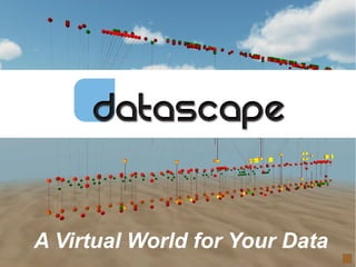
  • 1. © 2012 www.daden.co.uk A Virtual World for Your Data
  • 2. When all we had was paper we drew 2D graphs
  • 3. For over 10 years we've had computers with decent 3D graphics, and yet still all we draw is 2D graphs
  • 4. Isn't it about time we leveraged the power of our computers and started visualising data in 3D?
  • 5. 2D is simple and familiar, but as more and more data becomes available 2D struggles to cope
  • 6. Adding a 3rd axis lets us easily display another dimensions worth of data ... – such as time over a map plot of latitude and longitude
  • 7. Making the space immersive puts you in there with your data, you can see it from inside and out And since the data stays still whilst you move through it, your brain and eyes find they can relate to it as they do to the physical world
  • 8. Making it easier to see patterns and anomalies .. and easier to remember since the brain has ample visual and spatial cues
  • 9. And we can control not only the 3D position of each data point, but also its colour, shape, size, rotation and image … giving us potentially 8 – 12 dimensions for every point, sometimes even more
  • 10. To deliver the benefits of immersive 3D data visualisation Daden have created Datascape A desktop 3D immersive visual analytics application LocationtrackingonTwitterGPSdata
  • 11. Datascape sits at the user end of the data analysis workflow and can work with your existing data warehouse, ETL and 2D analysis tools Data Store Data Feeds Live Data Feeds Extract-Transform- Load Tools Datascape Existing Analytic Tools Via Excel/CSV or ODBC
  • 12. Datascape has a 5 step process.... 1. Import 2. Map 3. Visualise 4. Analyse Bring data in by CSV or ODBC Assign fields/columns in data to properties of plot point View and explore the data, refine mapping if necessary Apply search, group, highlight, filter, animation techniques etc 5. Re-iterate
  • 13. Data Import Through the data Source Plug-ins you can easily import and manage your data: • Import data from Excel or Comma Separated Variables files • Use ODBC to bring data directly in from other applications and databases, including live feeds (GPS, Twitter, RSS), Extract- Transform-Load tools and Big Data repositories • Import network and social graphs as nodes and edges files
  • 14. Workspace Management Workspaces are where you do your visualisations and analysis. You can create as many workspaces as you want, and save them with or without data. Tag and filter workspaces for easy management You can also copy, rename and delete workspaces.
  • 15. Field to Feature Mapping You can bring multiple datasets into each workspace. For each dataset you can define a unique mapping between the fields in the data and the plottable features of each data point: Position (x,y,z) Shape Colour Size (x,y,z) Image Rotation (x,y,z) Label URL Axis Labels (x,y,z) You can create simple or complex expressions to link the two, and we'll publish common choices on our wiki.
  • 16. Assist and Translation The Data Assist screen prompts you with the available fields, lets you preview their data, shows available shapes, colours and images, and reminds you of common functions. Translation Tables let you map values easily to colours, shapes and images with no scripting, and auto-fill lets the app do all the initial work to get you started.
  • 17. Scenery You can use bars and panels to create one and two dimensional axes. Panels can be assigned images, including grids, schematics and maps. You can also assign them web images via URLs, or OpenStreetMap. You can also use a central sphere, ideal for global plots. You can also choose between a variety of images and colours for the sky and ground. The navigation tree gives you easy access to all elements of the visualisation.
  • 18. Axes and Labels You'll find that you need a different sort of axis in an immersive data plot since you are not always “outside” the data in a position to see the axes lines. Datascape helps to overcome this in a variety of ways: • Adding guidelines down to the XZ plane to help pinpoint locations on maps • Adding axis end points on the horizon along the X, Y and Z axis
  • 19. Data Interactions With the data displayed you can fly through it at will, and look in any direction from any location. You can also lock your view to a single axis, or rotate around a single point. You can use the search dialogue to perform boolean queries on the data, highlighting selected groups, and/or manually adding to them. Groups can be saved, highlighted and used as the basis for further searches. Clicking on any point allows you to see all that point's data fields, use them as the basis of a similarity search, or open a related URL.
  • 20. Groups and Network Lines Network lines can be imported alongside node data, or generated dynamically to link points by a chosen field, e.g. all points for a particular user. The network lines can have mappings defined in the same way as nodes, controlling colour, shape, image, size and labels. You can tab through a group in order to see each point. You can also hide the main data set(s) so as to only leave one (or more) groups visible.
  • 21. Dynamic Filtering You can use the scrubbing bar to set a filter window on any field and manually sweep that window across the data, e.g. sweep a 1 week window across a whole year's data. The selected items can at any time be saved as a group for later analysis.
  • 22. Live Data If you are updating the Datascape database in real-time from an external feed/source then you can update the Datascape display in real-time too. Just set the update frequency and press play. If you have set up any groups then new items that match the search will be automatically added to the group and have any colour or shape over- rides applied. TwitteractivityoverLondon
  • 23. Bookmarks & Screenshots At any point you can press F12 to save a screen-shot to your hard-drive as a PNG image file. You can also select Add Bookmark to capture your current location and view, and then return to that point in the future by selecting the bookmark from the list on the Camera tab. Multiple bookmarks can be created, and used to present your analysis back to others by walking them through it. The Camera tab also lets you control camera speed and type. VASTSimulatedSocialGraph
  • 24. Examples On the next few slides we'll show you some examples of different visualisation types created using Datascape. You can see video examples, and details of how the visualisations were created,on our web site at www.daden.co.uk/datascape. VASTSimulatedSocialGraph
  • 25. Line Graphs Datascape allows conventional line graph data plotting, eg for scientific and financial data analysis, but in 3 dimensions. The Generate Network function can be used to connect data points, and multiple panels can be brought in to segment the data, for instance in to quadrants or octants. UKGDPvsFTSEIndexvsBankruptciesover20years
  • 26. Bar Charts Datascape can create 3D bar charts, and you can decide whether you want to have gaps between series (as here), or to have no gaps between them – giving you something more like a surface graph. One advantage of the 3D chart over its 2D equivalent is that you don't lose detail or relative scale if you have some bars which produce significantly higher values than others. InternationalCurrencyConversionRates–17currencies,20years
  • 27. Bubble Plots Bubble plots work really well in 3D, and in fact whenever you make size depend on a variable you are creating a type of bubble plot. As shown here you can also use a 3D shape from the Datascape library as a reference for the plot, and future versions will let you import your own 3D models. Simulatedtraumaandcanceroccurrencedataover10yearsbybodylocation
  • 28. Scatter Plots Scatter plots are commonly used to represent scientific and other research data where the relationship between variables is not yet know. By using three dimensions and letting you use shape, colour and size in more powerful ways you can create far higher dimensionality graphs than with most 2D tools, helping you to analyse data more quickly, and to detect more complex relationships. Systemsbiologyresearchdata–notyetpublished
  • 29. GeoTemporal Plotting A special case of the scatterplot is the geo-temporal plot, plotting Latitude and Longitude on the X and Z axis, and time on the Y axis. Such data could vary from scientific and business measurements, to live geo-coded social media feeds such as Twitter. TwitteractivityoverFarnborough,heightistime
  • 30. Spherical Plots Here we have plotted data onto a set of spherical axis, and then placed a globe in the centre. This is also a geo-temporal plot since height above the sphere/globe is again dependent on time. Eurovisionsong-contestTwitteractivity,colouredbyArtist
  • 31. Timelines Another common format is the time-line, where one dimension represents time, and the other axes are more abstract values (rather than geographic position). In this graph time moves away from the user into the screen. Each dot representing one computer transaction, and each line of dots a single computer having multiple transactions over time. Computerfirewalldata,timeintoscreen,IPacrossscreen,colouredbydatadirection
  • 32. Network/Social Graphs Network graphs can range from the simple to the very complex. Layout can be specified in the import file, or generated by the mappings. As well as social graphs you can also use network graphs to map relationships as diverse as the links between proteins and the topology of a computer network.
  • 33. Other Graphs These are just some of the most common graph forms that you can create in Datascape. Since we give you complete freedom about how you map data to the plot features, and a range of maths and string functions to use in those mappings, you are free to create whatever graphs you can conceive and script. We will be publishing the mappings for our favourite plots on our wiki and forum, and encourage users to do the same. Computernetworklogdata,24hrspercircle,dayperspiral
  • 34. Evidence Base Prior to building Datascape we undertook an MOD sponsored research project with Aston University to compare immersive with non- immersive 3D spaces for data visualisation. The results (summarised right) were encouraging, showing better performance in an immersive space on the majority of measures. We have also published a White Paper on Immersive Visual Analytics, which not only provides more detail of this study, but also provides a literature review of 2D and 3D comparison studies. Whilst 3D wont improve every visualisation, the indications are that it will improve many, and for the first time Datascape makes it really easy to evaluate 3D for your business.
  • 35. Advantages & Benefits We use the Benefits Linking diagram above to show how the key features of Datascape link to its main advantages over 2D and non-immersive 3D techniques, and how they in turn can be used to drive out soft and hard benefits to your business.
  • 36. Try It Now! Datascape is available as a FREE fully- functional 30-day trial download from: http://www.daden.co.uk/conc/datascape /datascape-download Licences are available for corporate users, and at a discount for educational, SME and solo users. There are videos and more information on Datascape available on our web site at www.daden.co.uk/datascape
  • 37. About Daden  Immersive 3D learning and visualisation specialists  Software and hardware based immersion  Founded 2004, but 3D experience since late 1990s  Award-winning:  US Federal Virtual Worlds Challenge winner 2010  Finalist 2013 Global Unity3D Awards  Times Higher Education Winner 2009 & 2013  Research-inspired:  Member MOD Dstl Synthetic Environments Tower  Over a dozen MOD and InnovateUK R&D Projects  Based in Birmingham UK
  • 38. © 2012 www.daden.co.uk A Virtual World for Your Data Web: www.daden.co.uk/datascape Email: info@daden.co.uk Video: www.daden.co.uk/vimeo Twitter: @dadenlimited

Editor's Notes

  1. We (and others) always felt that 3D immersion was better – but MOD funding allowed us to do a limited qualitative study. We hope to follow this up with a fuller study in 2012/13.
  2. We (and others) always felt that 3D immersion was better – but MOD funding allowed us to do a limited qualitative study. We hope to follow this up with a fuller study in 2012/13.
  3. We (and others) always felt that 3D immersion was better – but MOD funding allowed us to do a limited qualitative study. We hope to follow this up with a fuller study in 2012/13.