Interior Design Elements and Principles Explained

This was my final project for my Fundamentals of Interior Design course at Orange Coast College. We had to choose one interior room and explain all of the elements and principles of design found in that room. It took me about a week to put this together and I hope you enjoy it and get inspired for your own project! I was a psychology major, but I decided to put what I've learned in my psych classes together with my passion for interior design and change my major and now I am so glad that I did because now I feel that I am truly following my dream. I hope you too will follow your dream, no matter how you think others will feel about it. If you are a college student like me, the best advice I can give you is to choose a major that you are passionate about, because one day you will have a career doing something you love and my Dad told me once that if you love your job, you won't ever have to work a day in your life. Blessings to you on your journey, wherever on your life path you perceive yourself to be. Life is too short to not do something you love, and no matter what it is you choose to do with your life, remember that you are a human being, not a human "doing" and you are enough just the way you are! Much love and light out to you!

Recommended
More Related Content
Similar to Interior Design Elements and Principles Explained
Similar to Interior Design Elements and Principles Explained (20)
Recently uploaded
Recently uploaded (20)
Interior Design Elements and Principles Explained
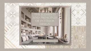
- 1. THE ELEMENTS AND PRINCIPLES OF INTERIOR DESIGN BY: SKYLER LEVI ID 00 FUNDAMENTALS OF INTERIOR DESIGN Spring 2023
- 3. Scale Human Scale The size of an object or space in relation to the human body. • The larger than average sized couch, coffee table and seats bring the eye down and make the room feel more casual and welcoming. • High ceilings could potentially feel overwhelming, so layering a few over-sized pieces helps to ground the room. Architectural Scale Tells the story of how it feels to be in that space. • High, dramatic ceilings enlarge this space, making it feel open, airy and opulent. • Floor-to-ceiling windows provide ample daylight which brightens the room, making it feel soothing and peaceful. Unexpected Scale Using an item with unusual proportions where it can impact the room by giving it the “wow factor”. • This room is spacious and accommodates the oversized, low- hanging pendant lights. Grouped together they resemble a beautiful chandelier and are delicate in a dramatic way. • The tall doorway adds to the openness of the space while the steps leading up and and out create another level of intrigue and excitement.
- 4. Proportion Color Lighter, cooler colors give the room an airier feel, and can be used to open a space; while warmer, brighter colors have the opposite affect, and bring the room in. The color scheme can alter the perspective of a room, making it appear bigger, smaller, taller or wider. • The cool, muted shades chosen for this room, enhance its spaciousness. • Light colors allow the eye to travel effortlessly around the space and highlights the intricate architectural detailing. Texture Rough or busy textures can make a room feel casual, cozy and more intimate; while smooth or plain textures can make a room feel formal, elegant and more spacious. • The texture of the walls and sofa soften and elongate the room. • The rough, natural wood coffee table and matching poufs bring the eye back toward the center of the room, instead of letting the high ceilings and windows carry the eye up and away. Line Vertical lines direct the eye upward making an interior ceiling appear higher and evoke a sense of strength and stability. Horizontal lines visually expand a space and can give a room a more contemporary feel. Curved lines can make a room feel soothing and calm by creating a sense of gentle movement. • The tall windows are elegant and luxurious paired with long, flowing French-vanilla curtains. • The horizontal lines along the layered ceiling, window-seat and wall niches elongate the room. • The curved lines on the window seat and sofa give the room a whimsical feel and guide you gently through the space. Light A brightly lit room will make the room appear large and open and a dimly lit room will make the room appear small and cozy. • The ceiling-high windows provide this room with ample natural light and its softness against the muted tones gives this room a feeling of peacefulness and serenity.
- 5. Visual Balance in interior design is the equal distribution of visual weight in a room. Balance is achieved with the placement of similar objects, combining rough and smooth textures or the way that the eye is guided around and through a room. Crytallographic balance finds harmony through repetitive patterns created by light shining through a surface. The variety of smooth and rough textures in this room has a dramatic and cohesive impact. The rough textured, wooden table and chairs have a heavy visual weight and along with their dark grey color, keep the eye centered instead of getting carried away by the vastness of the space. The large, bright windows are balanced by the negative space in the wall, and the fresh air from an open window can breeze across the room. With the use of soft, feminine curved lines, the eye is guided toward the stairs, up and out of the large archway which frames a flirty vignette of the next room. I imagine the sunlight shining through the wall cut-outs creating crystallographic designs in the next room. Balance Balance can be achieved symmetrically, asymmetrically and radially. Symmetrical balance is achieved when objects on either side of a central axis are mirror images of one another. Asymmetrical balance is achieved by using unlike objects on either side of a central point with the same perceived visual weight. Radial balance is when items are distributed evenly around a central point and radiate outwards.
- 6. Rhythm In interior design, movement is created when elements are repeated, alternated, progressed and transitioned in a space. Repetition is three or more of the same size and type of object repeated in progression. In this room, the triangle wall cut-out is a repeated motif. Alternation is when there are two or more elements in a regular pattern. The windows and wall spaces between them create an alternating pattern. Progression is the increasing or decreasing in size of repeated objects in a space. The decorative horses and the basket lanterns on the window seat go from smallest to biggest. Transition has a starting point and helps to navigate a space. The soft curves, rounded furniture and slightly arched wall seem to be all flowing together and gently guide the eye around the room. Rhythm can also be created using contrasting colors, textures, shapes and patterns. The various muted tones in this room create a sense of rhythm by allowing the eye to rest in certain places to admire the detailed styling and carefully curated art pieces.
- 7. Emphasis Emphasis is the creation of a dominant feature for a space or composition that is the first to demand your attention. Emphatic Light feature serves as the focal point. Dominant The wall cut-outs and niches command attention. Subdominant The cream-colored pillows, light fixtures, curtains and table decorations highlight the room. Subordinate The grey colored walls, sofa and carpet hold the room together. Emphasis
- 8. Harmony The combination of unity and variety to create a cohesive design; a sense of balance is achieved with the correct application of proximity, repetition and congruence of elements. Unity With the Use of Congruent Elements The use of repeating triangles and cones helps to unify the space. Triangular wall-cut outs, cone-shaped pendant lights and wall decorations along with a glimpse of similar items in the next room, Unity With Proximity Three ottomans are grouped together to form a welcoming seating area with plenty of room to move around. Unity With Repetition The planters are similar, not identical but create a visual interest, attracting the eye to the interesting architecture. Unity by proximity is achieved by placing like object close together to tell a harmonious story. Unity with repetition is when you have different types of one object grouped together. Unity with congruence of elements means taking a particular element and repeating it in multiple different ways around the space.
- 10. Space Positive space is the actual object or image. A room with more positive space will feel more intimate and traditional. Negative space is the area around or between an object. A room with more negative space will feel more open, airy and modern. Negative Space: Rectangular built in shelves Negative Space: Triangular wall cut-outs Positive Space: Cone shaped light fixtures Positive Space: Wall Positive Space: Coffee Table
- 11. Shape and Form Geometric shapes in interior design can be used to create a sense of order and structure. Common two-dimensional shapes are the circle, triangle and square and common three-dimensional shapes are the sphere, the cone and the cube. Triangle The triangular wall cut-outs Square Pattern on the throw pillow Circle The top of the seat cushion Sphere The ottomans Cone The hanging wall decoration Cube The cubed shaped wall cut-outs Juxtaposition is the combination of unlike objects in a space to create a dramatic effect. In this room, the smoothness of the wall and floors and the geometric wall cut-outs have a sleek, modern feel, and the curvy lines of the sofa and window seat are feminine and playful. At the same time, the use of natural materials have a grounding and casual effect. The modern, natural and feminine elements are juxtaposed to create a stunning, unique new look.
- 12. MASS Actual vs Optical Density In interior design the perception of mass and its visual weight depends on how strongly the element brings your eye towards it. Actual mass is the density and solidity of a form, and optical density is an object or material used to fill a space that may not have actual mass in it. Optical (Area in between coffee table and ottomans) Actual (Coffee table) Optical (Windows) Optical (Area in and around the light fixtures) Optical (Wall cut-outs) Actual (Wall) In this room, the optical density created by the wall cut- outs and niches, create a light airy feel. By opening this wall, it seems much less heavy. The room maintains a certain level of privacy without feeling closed off from the rest of the home.
- 13. The type of line being used in a room can have a dramatic impact on the feel of the space. • Vertical lines make the room seem taller, formal and more traditional. • Horizontal lines make the room seem wider, and more contemporary. • Angular lines create loft and movement which gives the room energy. • Soft curved lines are relaxing, playful and feminine. They also create a sense of slow movement. • Zig-zag and tightly curved lines create a feeling of quick movement and give the room an energetic and youthful feeling. The vertical lines made by the windows and curtains add height to the room, giving it an elegant, majestic feel,. The horizontal lines created by the multi-layered ceiling and along the top of the windows widen the room. The soft, curved, feminine lines created by the window seat and sofa gently guide the eye through the room. Line
- 14. Texture Coffee Table Wood Lanterns Ottoman Light Fixture Curtains Pillows Sofa Coffee Table-Top Rough Texture Smooth Texture Some of the rough textured objects are the wooden coffee table, ottomans and the lighter color wood lanterns. The material used to make the pendant lights have a seashell-like texture. The smooth surfaced objects like the sofa, curtains and floor soften the room, giving it a classy, feminine feel. The texture of objects and surfaces can drastically change the style and feel of a room. Rough textures have a casual feel, smooth textures are more formal and small patterns that resemble texture create a more interesting, livable space. The combination of rough and smooth textures give this room a unique look. Although the room is elegant and luxurious, the rough textured pieces keep it from feeling too formal.
- 15. PAttern The placement of emphasis when using a pattern, is the place where you want the eye to go to first. The character of pattern is the compatible and cohesive patterns that make up the aesthetic of the room. The scale of pattern is using various sizes of the same pattern to create a harmonious look. The color scheme is the combination of different patterns of coordinating colors. Various sizes of triangle and cone shapes add a cohesion to the room, but I would like to see another pattern thrown into the mix to add a little more excitement. Whether it was another throw pillow with a horizontal pattern to play off the lines in the zebra decorations, or another piece of wall art, perhaps with another triangular motif, there would be more variety in the scale of pattern On the throw pillows, the dark colored one with cool colored, muted shades, pairs beautifully with the simple, cream-colored throw pillow with an interwoven zig-zag pattern. The neutral tones of the throw pillows match perfectly with the room. In this room, the fabric patterns are on the throw pillows, one of the ottoman seat covers and the horizontal stripes on the zebra decorations. The placement of emphasis on the dark colored pillow is the charcoal grey diamonds and squares that match perfectly with the seat cover of the ottoman, and the dark wood of the coffee table A reoccurring pattern found throughout the room are the small groupings of triangular shapes. Although they are not fabric patterns, the light fixtures, the wall cut- outs and hanging art are all repeating the same shape and tie the room together.
- 16. Light Light is the most powerful element. It affects how we perceive and experience the other elements and principles of design. A lot of light, whether natural or artificial, increases the look of an interior space, while minimal or dim lighting encloses a space. Good lighting creates the atmosphere of a room, which in turn, effects our mood. Lighting has a profound effect on our mind, body and spirit, and should always be taken into consideration and placed thoughtfully when designing a space. In this room, the tall, wide windows with cream- colored curtains allow the light to pour in, giving it an open, airy and luxurious feel. The soaring high ceiling and windows illuminates the exquisite wall detailing, promotes a sense of spaciousness and adds to the beauty and drama of the room. Ample natural sunlight makes a room feel larger and more elegant, and studies have shown that plenty of natural light in your home boosts mood, increases productivity and promotes an overall sense of wellbeing Light
- 17. Color Color is a critically important element of interior design. Just like the element of light, color has the ability to transform the look and feel of a room and also has a profound effect on our mood. Warm colors, like red, yellow and orange advance on the eye, making the room appear small, intimate and cozy. Cool colors, like blue, purple and green, open-up a room and give it a calm, clean and inviting feeling. Neutral interiors are timeless and easy to work with. They give you the ability to change up furniture, fabrics, or styles with ease. Neutrals create an open, soothing and relaxed look and are suitable for any room. Although the ceilings are exceptionally high, this room has a warm, comforting feeling. Neutral colors, and muted pinks, browns and greys are calming, peaceful and allow you to relax and take in the beauty of the room. The soft tones open-up the space and provide a breathable, serene environment, without feeling cold or sterile. The combination of warm and cool undertones, create a layered look that is soothing to the senses. The light, neutral colors provide the perfect environment to get creative with a variety of textures and give a grounded, earthy feel when paired with the wood finishes, basket laterns, shell- like pendant lights and the ceramics in the wall niches that resemble pieces of coral.