
Recommended
More Related Content
Similar to WAYFINDING REDESIGN HORNET BOOK STORE
Similar to WAYFINDING REDESIGN HORNET BOOK STORE (20)
Recently uploaded
Recently uploaded (20)
WAYFINDING REDESIGN HORNET BOOK STORE
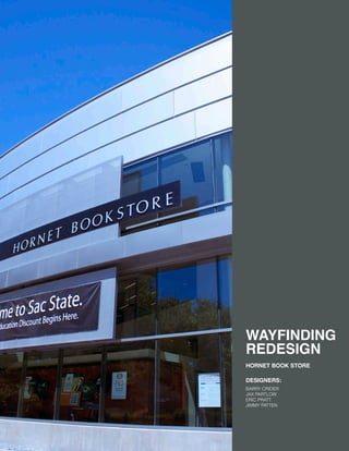
- 1. WAYFINDING REDESIGN HORNET BOOK STORE DESIGNERS: BARRY CRIDER JAX PARTLOW ERIC PRATT JIMMY PATTEN
- 3. Introduction p. 3 p. 5 p. 7 p. 9 p. 10 p. 12 p. 14 p. 18 p. 20 p. 23 p. 25 p. 26 p. 28 p. 31 p. 32 p. 33 p. 34 p. 36 p. 37 p. 38 p. 40 p. 43 p. 44 p.46 p.48 p.50 3 1. Site Assessment 2. System Development 3. Implementation Table of Contents Introduction 1A. Environmental Knowledge Topographical Knowledge Imaginability Findability Surveys Circulation Patterns Landmark Knowledge 1B. Sign Assessment Types of Signs Sign Locations Sign Type Pictograms Introduction Pictogram Development Final Pictograms Typography Color Palette New Signage Development Final Signage Programming Implemented Signs Painted Hanging/Mounted Standing
- 5. Throughout the day you interact and use vari- ous signs and systems to help you travel or find things successfully. This is called way- finding design. There are some these systems that have been perfected over the years. For example, the signage and systems for traffic have been adjusted and perfected overtime to make sure that drivers safely and success- fully find their way to each location. However, not all systems are as successful. Every building and store has a set system of how to direct their customer and visitor through their visit into the store. There are many locations at Sacramento State that do not have helpful wayfinding systems. To reach a better understanding of this type of design and understanding of how people in- teract with design. 5
- 7. SITE AS- SESS- MENT 1. For this project we decided to redesign the wayfinding system at Sacramento State’s book store. The book store is an important hub for the campus and every traffics around 3,000 visitors every school day. Whether it is buying school supplies, picking up textbooks or treating themselves the coveted “50 cent” coffee. To uncover how the building works and to break down the failures and success- es of their already in place wayfinding system first hand, we assessed the building’s envi- ronment and navigability. 7
- 8. 1A.
- 9. 1A.ENVIR- ONMENTAL KNOWLEDGE Understanding the building and systems already present will help us gain perspective on how to correct the system to help the cus- tomer in their experience. In anaylzing the building we looked at the various landmarks, did a survey of the environment and some procedures to see how the customer moved through the store. All of these are very impor- tant to help us create a concise system. 9
- 10. TOPOGRAPHICAL KNOWLEDGE To understand the building better we an- alyzed and separated the merchandise into different accesible places. Color coordinat- ing to clearly see the different sections. We noticed that there were 14 different sections and saw that apparel and textbook took up the most amount of space. LEVEL 1 10
- 11. LEVEL 2 11
- 12. IMAGINABILITY To survey the building we first looked at the configurational or topological knowledge of the environment. As part of the survey we asked customers to draw how they imagined the store. This helped to reveal what parts of the store were most memorable and most important to place signage in. Imaginability Survey 1 -had clear knowledge of sections -couldn’t specify merchandise or textbooks 12
- 13. Imaginability Survey 2 Imaginability Survey 3 -knew the merchandise of the store well -didn’t know the upstairs -knew the topographical locations of the merchandise displays but didn’t know what the sections were 13
- 14. FINDABILITY SURVEYS Findability Survey #1 Level 1 Instructions: 1. Locate a men’s sweatshirt 2. Locate a Sac State binder 3. Purchase a $0.50 coffee 4. Locate an iPad. 5. Check out at front counter. -confused immediately -noted looking at 4 different signs before knowing where men’s apparel was -after figuring out signage was able to locate everything to solve: put a directional in the front of the store signaling where everything is Another part of the survey included some findability excercises, in which we would ask a random person to collect various items in the store as we observed how they got from A to B, as well as the difficul- ties or suc- cesses they had. 14
- 15. Findability Survery #2 Level 2 Instructions: 1. Locate Computer Science textbooks 2. Locate calculus text book 3. Book rental line entry 4. Purchase textbooks -confused about set up of textbook -didn’t understand the alphabetical order -after locating the first book found it difficult to find the other’s shortened name -check out was simple to solve: create a new method of organizing the books, not using the shortened version of the major name or alphabetical order 15
- 16. FINABILITY SURVEYS Level 1 Instructions: 1. Get a woman’s tank 2. Get a backpack 3. Check out Alumni gear 4. Get a men’s hat 5. Purchase goods at the cafe, with a .50 cent coffee. -knew the book store well so was able to go to each section -had difficultly within the section to solve: make clearer sub-section signage 16
- 17. Finability Survey #4 Level 2 Instructions 1. Get a binder 2. Get an Anthropology textbook 3. Get a Criminal Justic textbook 4. Get a calculus textbook -didn’t realize immediately that it was alpha- betical -found difficulty reading the signage be- cause of the colors to solve: fix signage colors, create a new method of organizing not using alphabetical system 17
- 18. CIRCULATION PATTERNS For the ciruclation patterns, we sat in the book store and saw the patterns in which people walked around the store. The pat- terns were very clear and easy to see, the movement of the people was obvious and in rows that correlated with the merchandise layout of the store. The errors on the first floor we noticed was that there was no directional features signifying what was in the store and how to get there. This greatly affects the cir- cula- tion patterns because people wander aimlessly through the store. 18
- 19. For level 2, the errors we noticed that was that there was no signage up stairs or signifi- cation of what was upstairs. 19
- 20. We looked at the store and it’s varying land- marks. For floor 1, we recognized that the landmarks include the Apple Store, customer service, school supplies and cafe. Floor 2 is more clearly laid out, having only two land- marks: the text book sections, and the check out counter. School Supplies Café Apple Store Customer Service Landmark LANDMARK KNOWLEDGE 20
- 22. 1B.
- 23. 1B.SIGN ASSESSMENT We collected an inventory of all the signs that are already in the store. Within way- finding systems there different types of informational signage. Identification signs, are visual markers that display the name or function of the space. Directional signage, present cues on where the customer needs to move. Informational signage offers the customer an overiview of their surround- ings, for example a directory. And lastly, regulatory or restrictive signs, showing the do’s and don’t of the place. 23
- 25. TYPES OF SIGNS There are different types of signs that allow the customer to know where things are, if they can access certain areas, general knowledge etc. For the following exercises we identified all the different types of signage already established in the bookstore. IDENTIFICATION: Visual markers that display the name and function of a place of space, whether it is a room, an individual building, or a campus gateway. They appear at the beginning and end of routes, and indicate entraces and exits to secondary destinations. INFORMATION SIGNS: Offer visitors an overview of their surround- ings in the form of comprehensive site maps and directories. They are usually large, free- standing units readily visible to many people simultaneously, or wall mounted. DIRECTIONAL SIGNS: Provide the necessary cues that users need to keep on the move. This type of sign routes direct visitors between key decision points, desinations, and exit points by displaying type, pictograms, and arrows. RESTRICTIVE SIGNS: Describes the dos and don’ts of a place. 25
- 28. SIGN TYPES LEVEL 2 There are many different types of signs throughout the bookstore. For the types we saw the most of and needed improvement we didn’t an analysis to better understand what we would need to accomplish in the develop- ment of the new system. The hanging signage throughout the store is themost obvious and supposed to be the most helpful. How- ever, accented by the dark store, the dark gold and black are of similar value creating difficulty in legibility. The mounted signs are secondary to the hanging, reading in- formation about the particular objects on the shelf or within the section. These had the same prob- lems as the hanging in that the text was not legible from a distance. 28
- 29. The standing signage through- out gives general and promotional information for the store. These are spurraticly placed through- out the store, with no thought. They do not supply helpful information about the store and location of objects. However, they have a lot of potential to be helpful with some thought behind them. 29
- 31. SYSTEM DEVEL- OPMENT 2. After surveying all the information in site as- sessment, we were well equipt in how we were going to tackle the bookstore and it’s new wayfinding system. In developing the new system we looked at the old system, as well as put our creative taste and spin on the new look. Being apart of the audience that uses the book store it was easy for us to make selections that we knew would apppease our fellow class mates. This section, shows our process in deciding text, new icons, directo- ries and systems to better help the customer in their experience. 31
- 32. PICTOGRAMS INTRODUCTION Icons are extremely useful in identifying objects and sections in a short period of time. For the bookstore we figured that utiliz- ing this medium would help our customer tremendously in finding all their book store purchases and needs. 32
- 33. PICTOGRAMS DEVELOPMENT = 9 8 7 6 5 4 3 2 1 c . 0 + - In creating a practical and recognizable icon, there were many stages in developing. The process in developing all the icons was long, we wanted to make sure that we took all the steps necessary to create something that worked efficiently. To show the process of how we created each icon, here is the development of the icon for school supplies. Starting with images that directly correlated with school supplies, we sketched out and simplified the objects. From there we decided on a style that would be work, trying outline, filled, intersecting etc. After decid- ing that we were going to do filled symbols, because we thought that would be bold and better show the information off. From there we did micro edits, and did some things that would make assimilate it with the type. By taking parts of our chosen type, helvetica, we took the counterpart of the “O” and used it to hold our pictograms. The next step was just to adjust and make sure our audience understood what the icons meant. By show- ing it in class and doing a survey, we saw what improvements needed to occur in the icons. With that information it helped us final- izing and solidfying our pictograms. this shows the edit from regular circular shape to that of the Helvetica O counterpart 33
- 34. Health & Human Services Computer Science Mathematics Business Admin. Education Natural Sciences Arts & Letters Interdisciplinary Studies Engineering Social Sciences PICTOGRAMS COLLEGES The biggest change we made in the navigiability of the original signage was to change the set up of how the textbooks are organized. We realized that one of the biggest problems in the system already established was how the textbooks were displayed. We, with the opinions of others, found it to be very difficult to find what they are looking for. Being organized alphabeti- cally was not helpful, so we decided to split up the sections by colleges. For example, in the Arts & Letters college, there would be graphic design, interior design, photography etc. This is our collection of college pictograms. 34
- 35. Café Apple Store School Supplies Women’s Apparel Magazines Men’s Apparel General Reading Baby’s Apparel PICTOGRAMS STORE SECTIONS The final symbols we worked very hard to make them all cohesive and it is very clear in the output on how well they work together. 35
- 36. TYPOGRAPHY DEVELOPMENT Type development for the project was very simple. When creating our pictograms we started to see that the shape and boldness mimiced that of the typeface, Helvetica Bold. As well, the bookstore already used the typeface, so it was easy to intregrate with the look and feel of the store already. With that in mind, we adjusted some of the illustrations to match the typeface. Overall it was an organic process in picking the typeface and we think suits the bold nature of our icons, and where we see the look of the bookstore going. Aa Aa 36
- 37. COLOR PALETTE FINAL For the color palette for the signage, we noticed there were some changes that needed to be made. Originally all the signage was black with a very unlegible gold color to fill the type. We recognized that this was a problem. The values of the color we too close, so our biggest task was to change the colors to be more recogniz- able and legible. As well, blend well in the environment. The store has an obvious complimenting color palette interiorly of Sacramento State’s colors, so we needed to create another palette that compliment- ed that. For selecting the color palette, we looked at the books in the book store to give us some more up to date colors, and combined that with some colors demon- strated in the interior design selections. CMYK: 15 4 50 0 RGB: 220 223 151 CMYK: 67 54 56 31 RGB: 80 87 86 CMYK: 28 86 73 21 RGB: 154 60 62 CMYK: 31 10 16 0 RGB: 175 203 207 37
- 38. NEW SIGNAGE DEVELOPMENT In creating new signage to incorporate the pictograms and new text format, we looked to the building to inspire the shape. We developed three different signs. Hanging, standing and mounted signage we created to solve our problem. Changing the signs to be better recogniz- able, legible and overall more dynamic were our biggest challenge. Utilizing the unique arch infront of the building helps bring the outside in and adds a creative solution to the design. For all three of the signs, we 38
- 40. HANGING SIGNS MOUNTED SIGNS PAINTED SIGNS We knew that we wanted to keep the hanging signage due to the amount of merchandise and clutter on the floor, as well as the high ceilings. In- corporating the new design, we believe allievated the difficulties set previously with the signage. The mounted signs, we simplified and made more legible. It wasn’t a difficult task, just utilizing the design already created for the hanging signage. Lastly, to stick with the boldness of our previous signs we utilized the wall space with the painted decals. For customer service and directionals for the textbooks, we created big, loud wall direction- als. Seeing that one of the biggest issues was that people could not identify where to go for the textbooks, the big arrow can be seen across the store immediately connecting with the customers and giving them where the textbooks (and the reason for the bookstore) can be found. NEW SIGNAGE TEXT B O O K S 40
- 41. For the standing signage, we used the same arching shape, that was incorporated in all the signage. Creating a standing sign system was the most important of all the signages. This was something that was not already implemented into the signage system set previously. When creating this new set we looked at other stand- ing signs that we effective on campus and proved to be inspiration for our signage. STANDING SIGNAGE 41
- 43. SYSTEM IMPLE- MENTA- TION 3.After the development process was done, we placed the signage into the area. We believe we were successful in creating something that not only solved the issues presented previously, but was a creative and dynamic designed system. 43
- 44. IMPLEMENTATION Programming Using the analysis from the circulation pat- terns, understanding the merchandise set up, the problems presented combined with our general understanding of way-finding design, we placed the signage accordingly. The new system most importantly gives directional signage in the front of the store for immediate interaction with customer. From there we placed indentication signs and our updated mounted and hanging signage. The more legible signage and the addition of the directional signage, will greatly improve the customer’s happiness in their experience. LEVEL 1 44
- 45. For Floor 2, we intregated a new system to separate the textbooks. By separating into colleges, it is less confusing. Seeing the bold icons lead you to the correct sections and easily access your books. This allows people within their college and major to get their text books with ease and not having to think about the shortened version of the name of their major and the alphabetical location. This is our greatest success in the implemen- tation of new way-finding IDENTIFICATION DIRECTIONAL INFORMATIONAL RESTRICTIVE LEVEL 2 45
- 46. 46
- 47. 47
- 48. 48
- 49. 49
- 50. 50
- 51. 51
- 52. 52
- 53. 53
- 54. 54
- 55. 55