The Decline of Farming in Iowa's 4th District

This slide show, primarily using county-level data from the Census of Agriculture, (1950, 1969, 1992, 2017,) shows the decline of farming in Iowa's 4th Congressional District. The focus is on the decline in the number of farms with livestock and poultry, leading to the loss of the diversity of sustainable "livestock" crops, (pasture, hay and oats,) leading then to damage to the environment. While a large majority of farms in the 4th District had several kinds of livestock, plus poultry, in 1950, few had any livestock or poultry in 2017. A similar decline is seen in the number of farms with any oats, hay and pasture, and in the resulting acreages that can form sustainable crop rotations. This change away from environmental sustainability occurred as farm bill price floors were reduced and ended by Congress, as it moved away from the farm programs of the Democratic New Deal. So this occurred under increasingly Republican farm policies and programs that were designed to force farmers to subsidize agribusiness with cheap farm products. In being forced to subsidize the loss of their own value-added livestock to CAFOs with cheap, below cost grain, the core sustainability of these farms was lost, making environmental problems highly likely. So, it's from enormous economic farm injustice, (not from rewarding farmers, that never happened,) that the damage to the environment has occurred.

Recommended
Recommended
More Related Content
Similar to The Decline of Farming in Iowa's 4th District
Similar to The Decline of Farming in Iowa's 4th District (20)
Recently uploaded
Recently uploaded (20)
The Decline of Farming in Iowa's 4th District
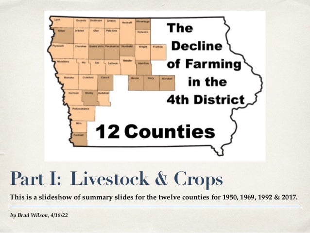
- 1. by Brad Wilson, 4/18/22 Part I: Livestock & Crops This is a slideshow of summary slides for the twelve counties for 1950, 1969, 1992 & 2017.
- 2. The Decline of Farming: HOW &WHY ✤ This slide show explores the “HOW” question, how farming declined since the 1940s, first in livestock, then in crops. ! ✤ Here we see how the decline in farming led to a decline in the rural environment. ! ✤ This is Part 1, which uses county level data from the Census of Agriculture for 12 counties in the 4th Congressional District. This slide show presents summary data for the 12 counties. There are also separate slide shows for each of the 12 counties.! ✤ A second slide show, Part 2, explores the “WHY” question more generally, in terms of politics, policy and economics.! ✤ A third slide show, presents county-level data on economic impacts and related impacts on farmers. Part 3.
- 3. Source for county-level data: USDA-NASS: The Census of Agriculture.! See https://agcensus.library.cornell.edu and https://www.nass.usda.gov/AgCensus/. Loss of 60% of Farms The 12 counties started with nearly 25,000 farms in 1950, falling to nearly 10,000 in 2017.
- 4. Prices followed them right DOWN! Subsidies were added later, but farmers got LESS WITH SUBSIDIES, not more.! Via cheap crop prices, farmers were forced to subsidize the loss of their value added livestock & poultry to CAFOs.! Total value declines for U.S. agriculture since 1952 are measured in trillions of dollars. See slides below & in Part 2. ButWhy? Briefly: Decline of Price Floors Congress lowered & ended Price Floors, (needed because free markets chronically fail for agriculture).! There are other factors, of course, but this is the biggest economic & political change since 1952. Note: “100% of Parity” is a standard of economic justice.
- 5. KEY: 4 CensusYears: 1950, 1969, 1992, 2017, (blue). CONTEXT: Farm Bill History: Rise (1933-1941) & Fall (1953-1995) of Price Floors, (tan). Parity years (green). Most slides feature the 4 census years shown in blue. 1950 was a “parity” year of “living wage” minimum farm Price Floors. 1969 & 1992 were years of declining Price Floors. Price Floors were ended in 1995. Slides show impacts of policy decline.
- 6. Date Huge Decline: Farms withValue-Added Livestock # of Cattle, hog, dairy & poultry farms: declined MUCH FASTER than farms generally.
- 7. This project focuses on MACRO CHANGES, leaping from 1950 to 1969, to 1992 to 2017. This is the BIG PICTURE. This is NOT about small, short-term, incremental changes. COUNTY Data from the Census of Agriculture Census data has a larger margin of error, but enables us to see changes at the county level.
- 8. Date Livestock Farms: % of All With cheap prices, the number of farms fell. Value-added livestock & poultry fell even faster.
- 9. Date Farms with Milk Cows Fell Even Faster Decline here is much greater than for farms with cattle & calves.
- 10. While there have always been fewer sheep farms, the general pattern here is the same. Sheep: SameTrend Line Decline of SHEEP: another GRAZING animal.
- 11. Date “Livestock CROP” Diversity: Huge Decline Livestock Crops: pasture and hay. Oats: nurse crop for grass, alfalfa & clover.
- 12. Date Less Pasture, Hay & Oats: % of all Crop Farms
- 13. Date Soybeans: An exception: Few to Many Soybeans was a new crop, with growing demand rising as diversity fell.
- 14. *During the parity years, OAT farms increased in number, corn farms fell in number slightly across the 4th District, according to census data. Learn more about Parity and the decline from Parity in Part 2. Parity: More Oats, Less Corn* 1942-1942, the years of 100% of Parity (green).
- 15. Learn about the Democratic Party farm Parity programs in Part 2. ParityYears: 1942-52: Livestock Sales Farms with Cattle & Hog Sales INCREASED with PARITY (green). FELL with Price Declines.
- 16. Learn about Price Floors and Supply Management in Part 2. ParityYears: More Oat Acres! Oat acres increased during the parity years, declined as Price Floors were lowered (tan).
- 17. Date Decline in the ACRES of Diversity Pasture, hay and oats declined following the Parity level of 1950, with acres going to corn.
- 18. With cheaper and cheaper prices for feed grains, farmers subsidized the loss of value-added livestock to CAFOs. Decline in the Diversity of Sustainable Crops Acreage of sustainable “livestock crops” declined with reductions in Price Floors, loss of livestock.
- 19. Date Increasing Cropland? FromWhere? Without Livestock, permanent pastures, on hills, near streams, are now being used for crops?
- 20. 01 Diversity & Crop Rotations ✤ The mix of crop acreages shows up in crop rotations. Diverse rotations are especially needed to protect sustainability on hills and near streams.! ✤ Top: 5 year Rotation: greater diversity & sustainability. Note the percentages needed for diversity, with corn, in this rotation, occurring twice.! ✤ Bottom: 2 Year Rotation: less diversity & sustainability. Reduced rotations cause less harm on land that is more flat.! ✤ See more examples, (with relevance for highly erodible land,) on the next slide.
- 22. Compare the Next Pie Charts, 12 Counties: 1950, 1969, 1992, 2017 ✤ Similar to the Crop Rotation Charts, (above,) the actual Crop Percentage Charts for the 12 counties, show the possibilities for diverse, sustainable Crop Rotations, on the 4 census years.! ✤ With cheaper and cheaper farm prices, and with farms increasingly subsidizing CAFOs, & losing livestock & poultry to CAFOs, to then lose the diversity of livestock crops, Rotations became less sustainable.! ✤ The 4 charts on the next slide, are presented in order, clockwise, with the 2017 chart directly below the 1950 chart, to emphasize the dramatic contrast.
- 24. Questions (For Answers see Part 2) ✤ Why did these changes happen?! ✤ What are the biggest farm policies affecting these changes?! ✤ Who called for policy changes to eliminate 1/3 of U.S. farmers and farm workers within five years?! ✤ Who fought back against these changes?! ✤ Which side did politicians take on these changes?! ✤ What policy proposals would reverse these trends?! ✤ What does research show about alternative policy proposals?